Credits to team members

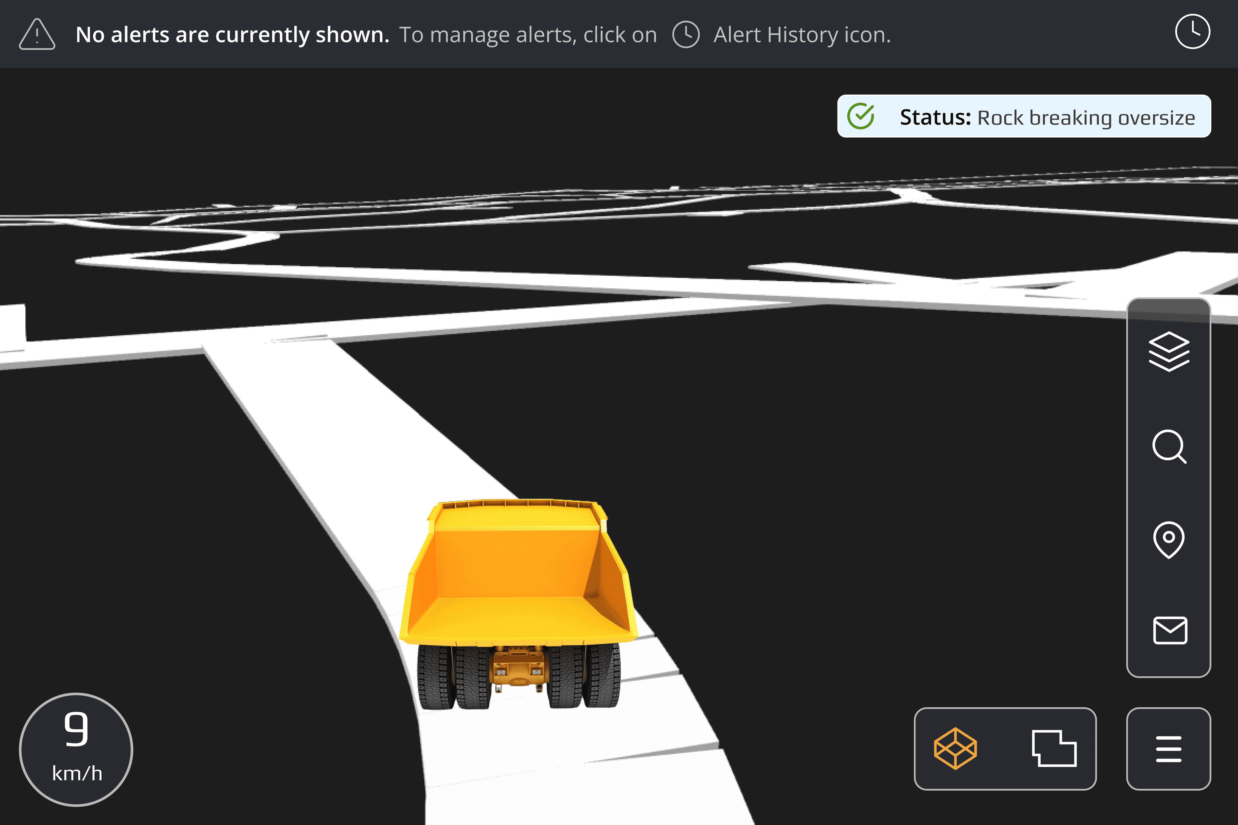
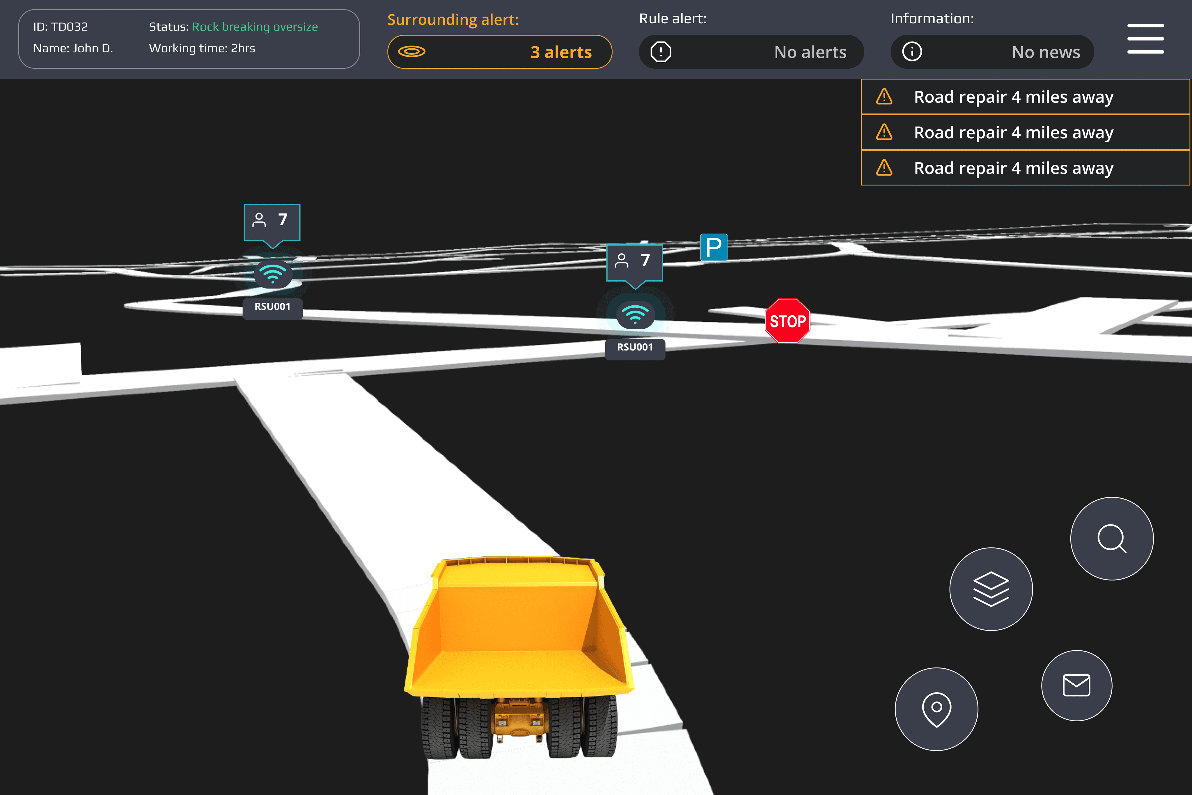
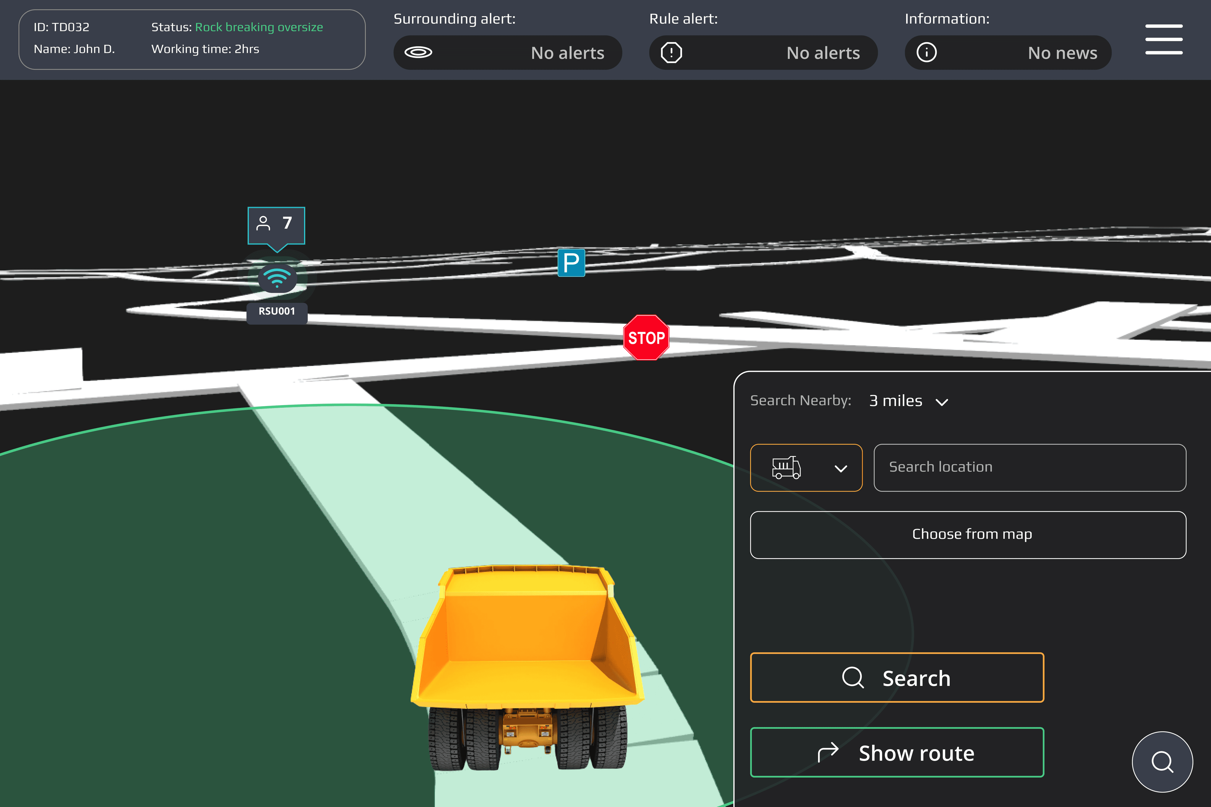
The first iteration aimed to adapt core features from the web app to a tablet-friendly layout, and put required data on a smaller screen. We also conducted interviews with operators to gather insights on their specific needs and requirements for real-time navigation and monitoring.
Methods used: Brainstorming with the team --> User Interview -> Design walkthrough -> Usability testing
Challenge:
Adapting the web-app interactions to be effective and easy to use on a tablet.
Balancing the display of complex, real-time data on a limited screen space without overwhelming the user.
Result:
The main buttons located at the bottom right were too small for the operators.
Pop-up windows were also too small.
Alert pop-ups were too small for large data-driven alerts.
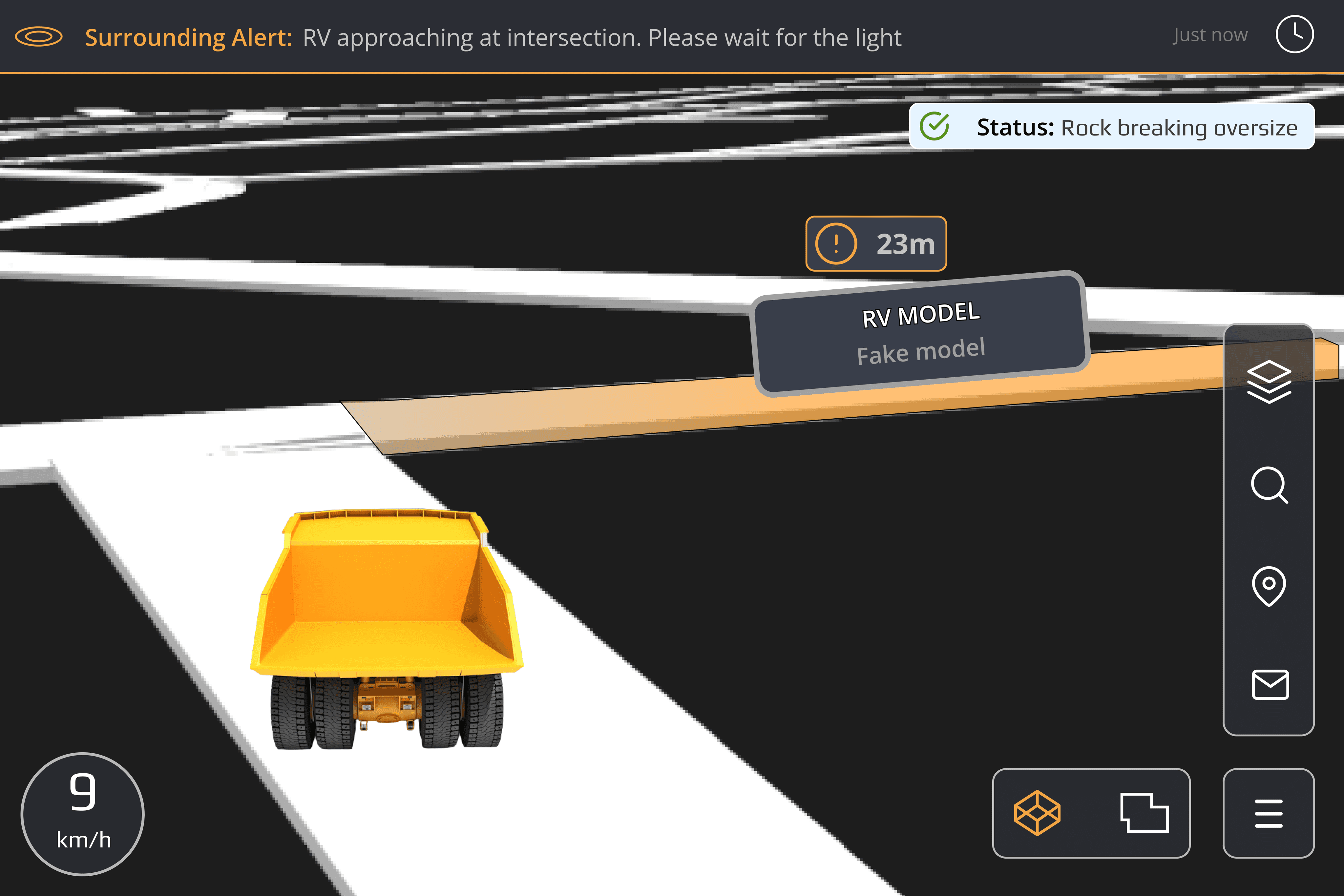
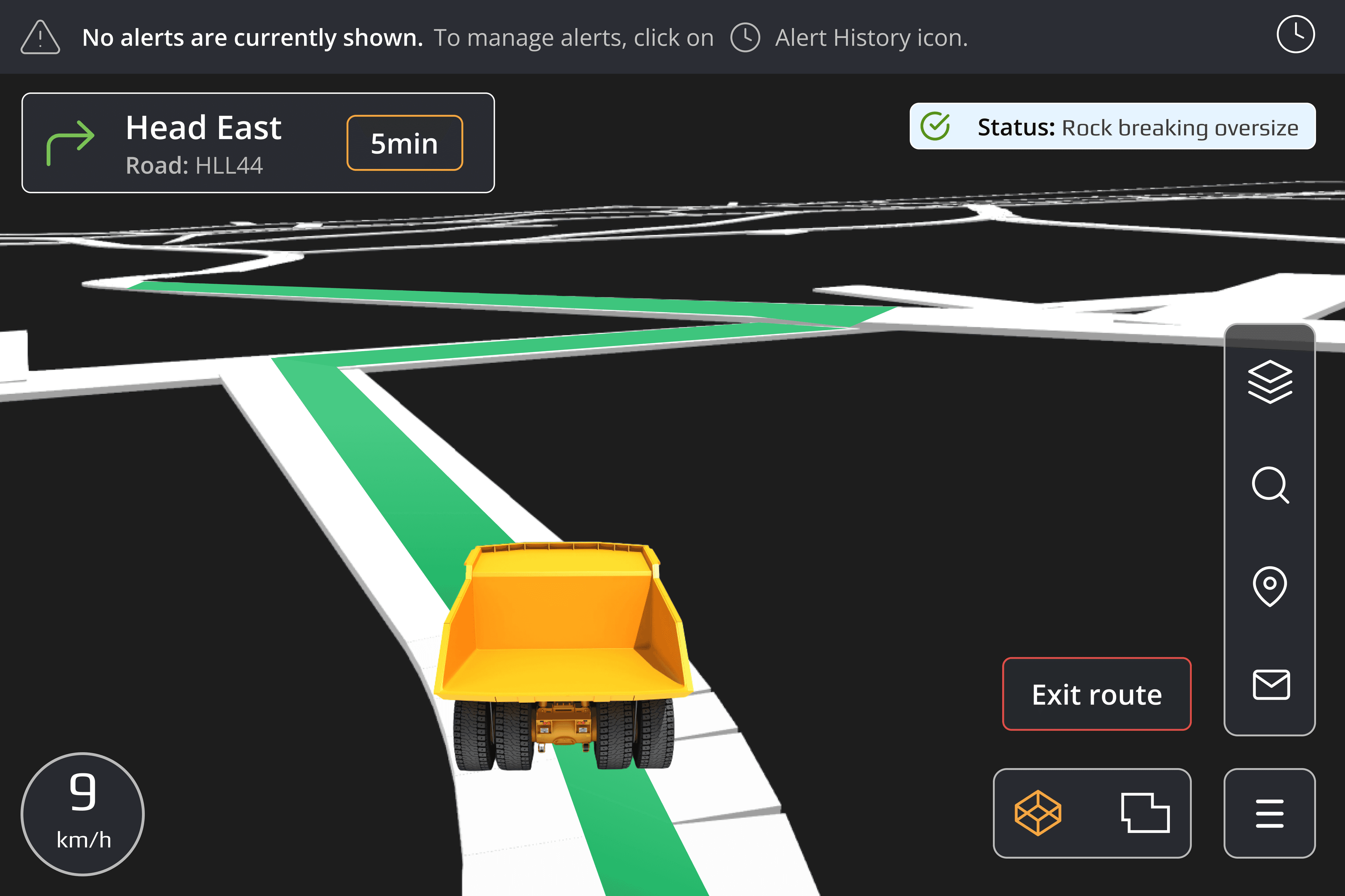
After conducting usability testing on the previous iteration, this version concludes with the final delivery by providing more structured navigation and UI improvements.
Methods used: Information Architecture -> Usability Testing -> Design walkthrough
Challenge: Prioritizing the operators who are often driving and have limited capacity for complex interactions was challenging. Understanding their natural gestures and behavior while driving was crucial, as they needed an intuitive experience with minimal distraction.
Result:
The alert section is more effective in providing more data and information
The re-structure of the app menu navigation was more effective slightly bigger size and revised icons.
RULE ALERT
Receive alerts if the vehicle exceeds any set limits
SURROUNDING ALERT
Receive alerts regarding surrounding actions
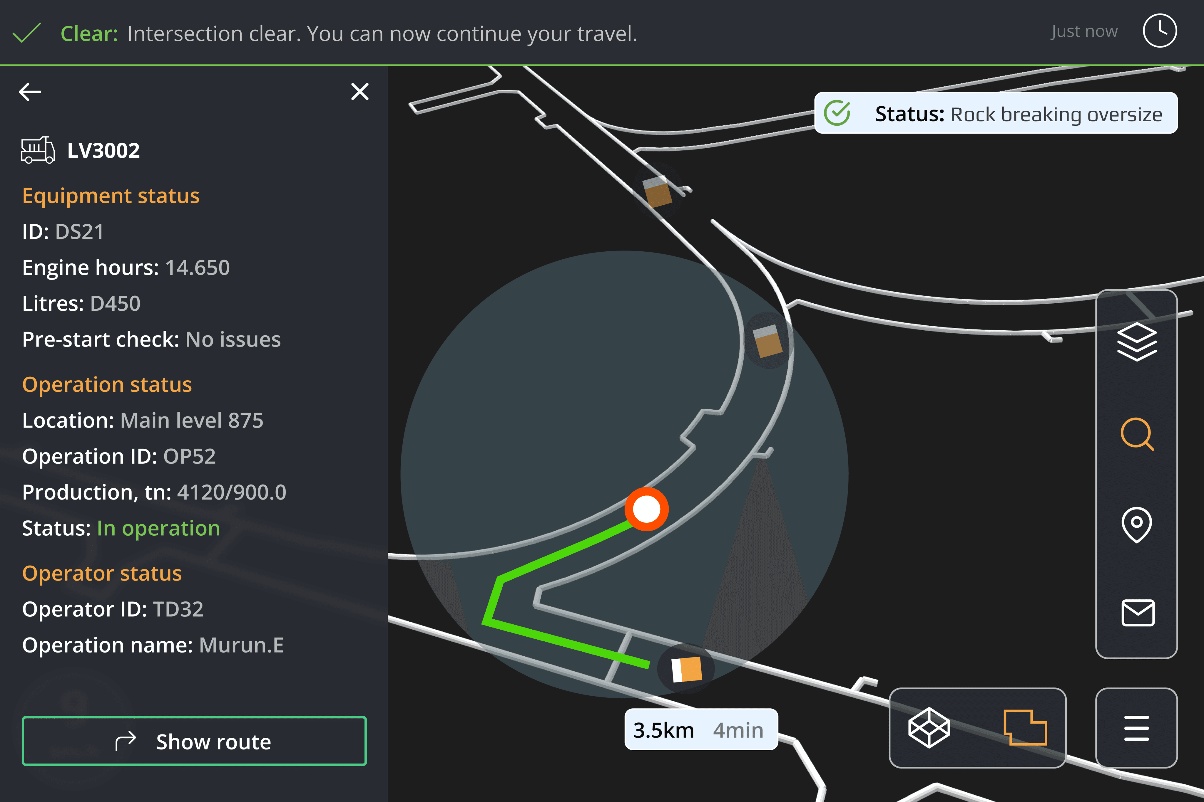
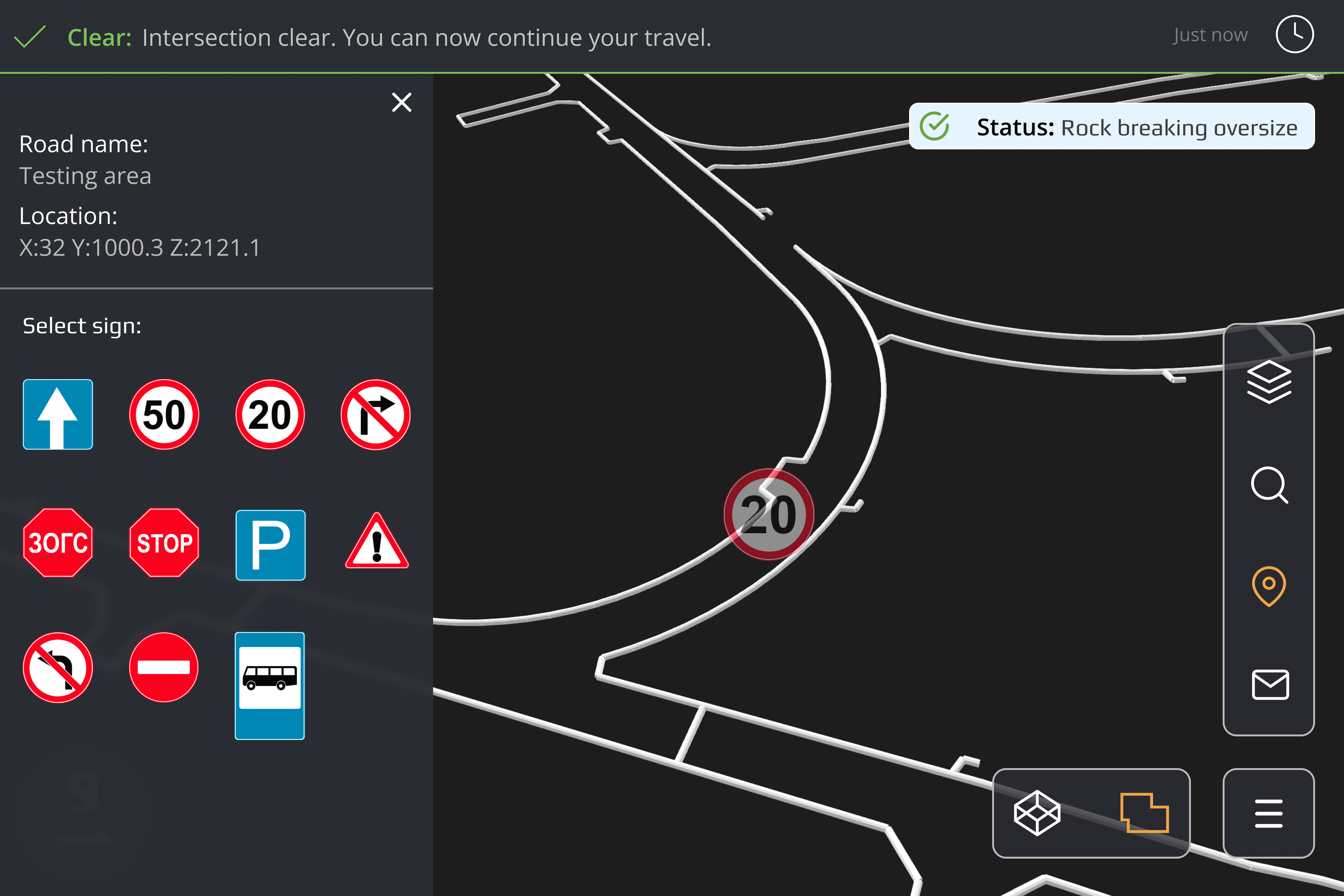
SELECT OBJECT & VIEW INFO
Brief information about the objects on the map
DIRECTIONS
Provides directions to a selected object or destination
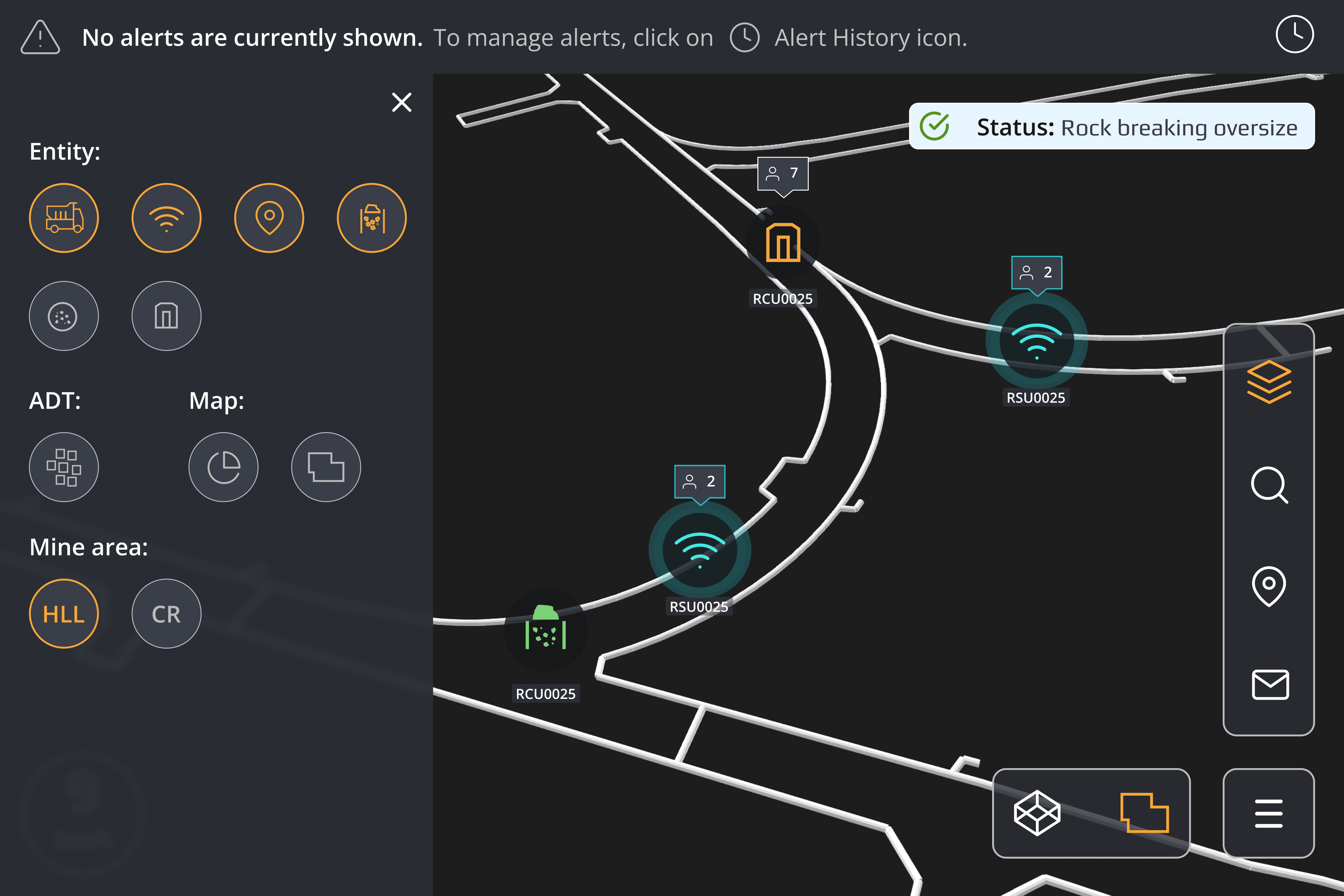
MONITOR OBJECTS
Toggle on & off to monitor objects on the map
ANNOTATION
Set road maps on the map
I learned that adapting heavy data and complex information to a small tablet screen requires careful consideration of layout and prioritization. Translating web app features to a tablet involves balancing functionality with simplicity, ensuring that crucial data is easily accessible without overwhelming the user. This process taught me how to design for limited screen space while maintaining clarity and usability.
See other projects
