Credits to team members
Goal
90%
Labor cost saving
30%
Fuel cost saving
10%
Improvement in dillusion
Business Perspective
“Incorporating Edge Computing and IoT technologies specifically designed for industrial settings with challenging environmental conditions”
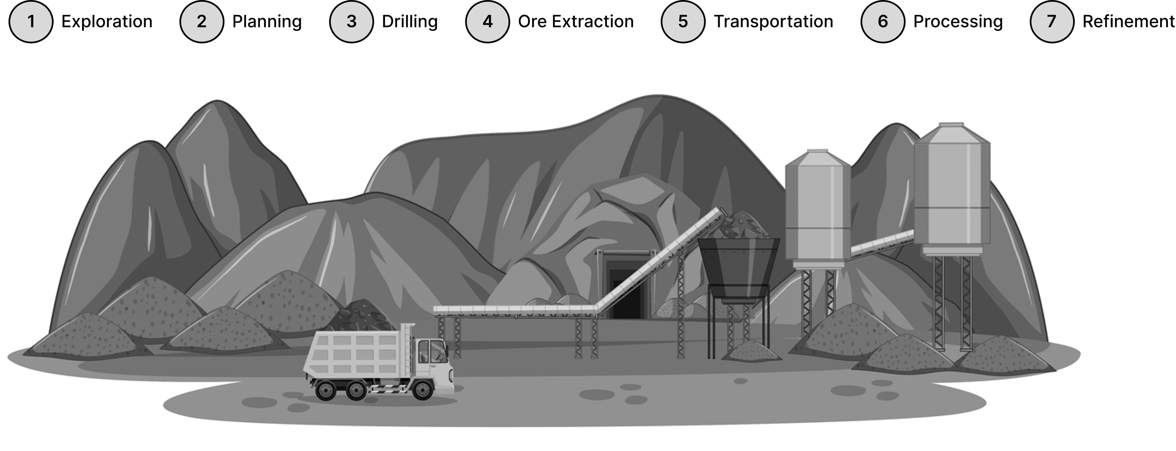
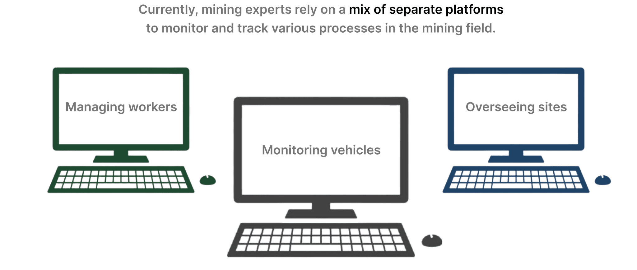
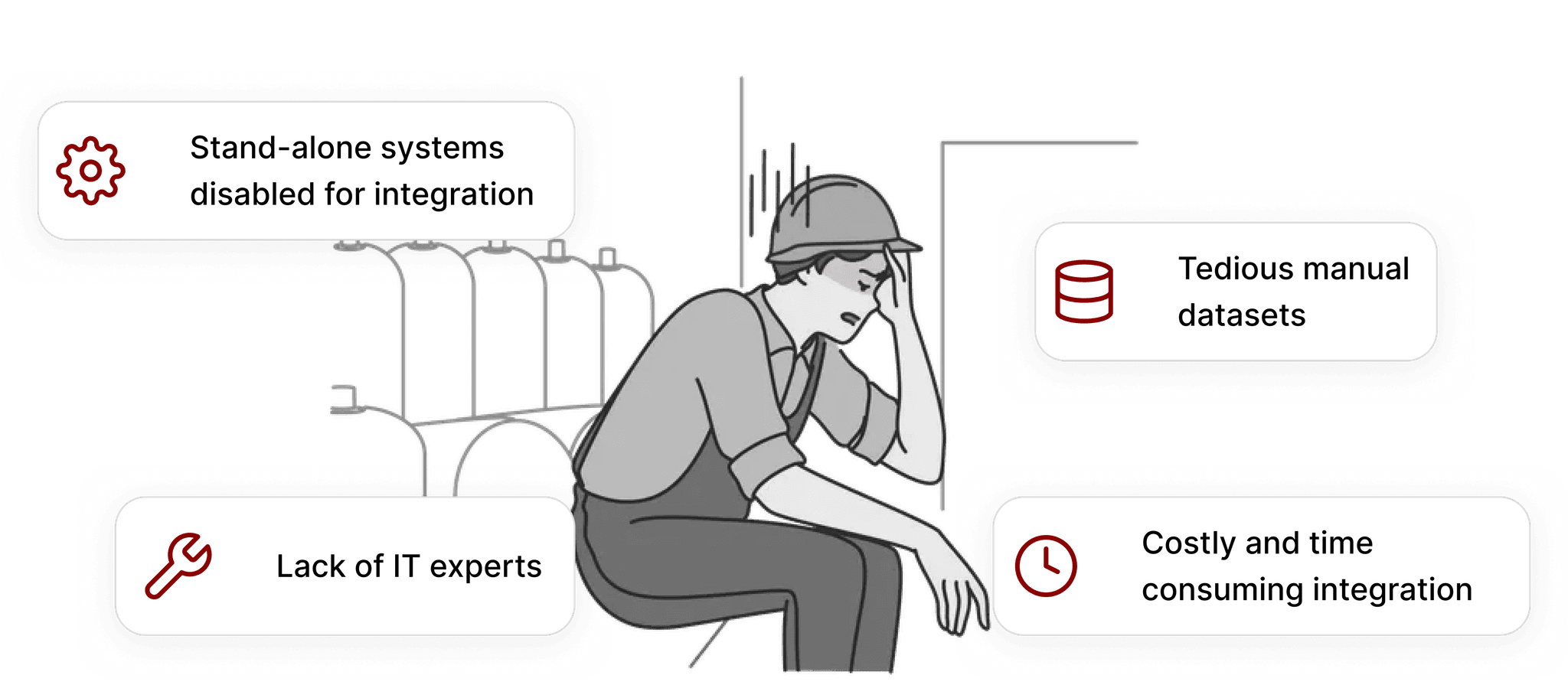
WHAT HAPPENS IN MINING OPERATION?
Advanced technology levels (Technology Specialists, Senior Engineers)
Open & Ground mining engineers
SOLUTION
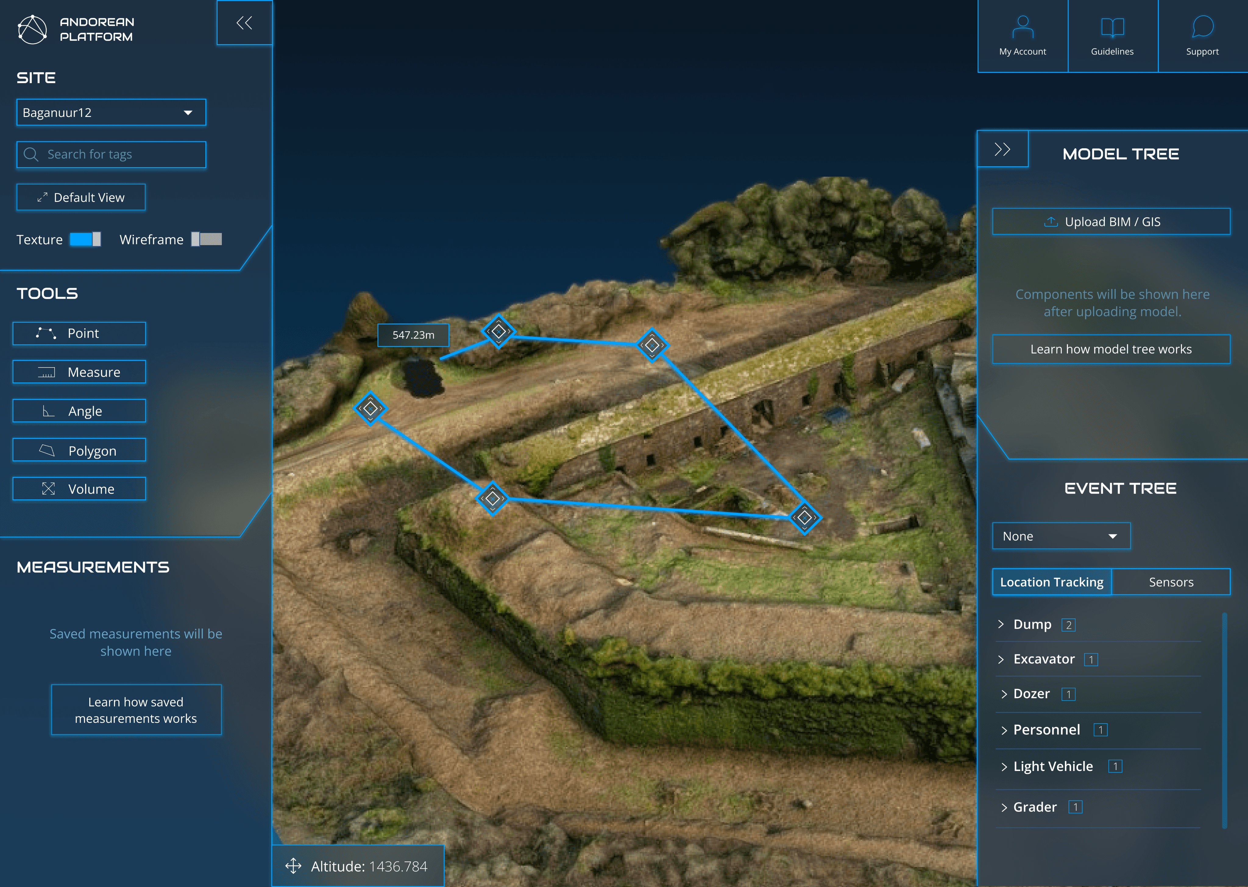
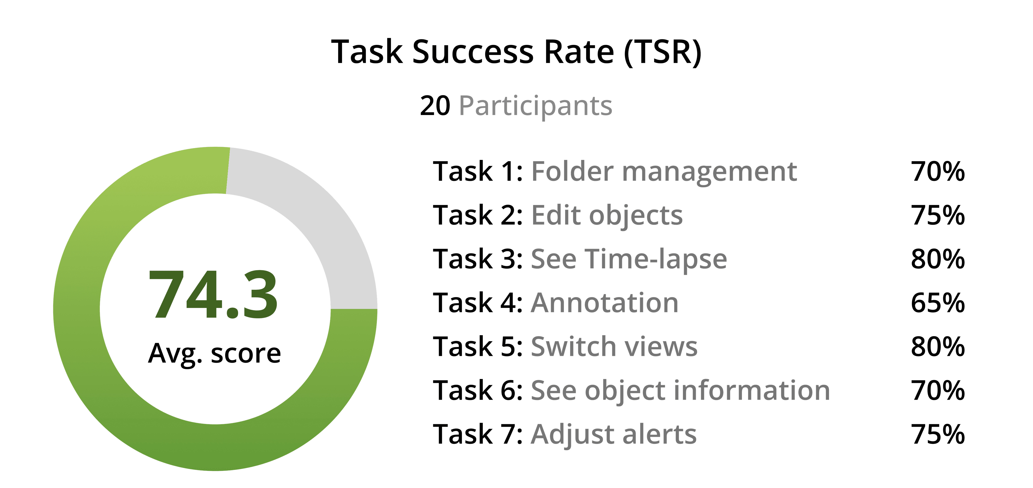
Methods used: Brainstorming with the team -> User flow -> User Interview -> Design walkthrough -> Usability testing
Challenge: Visualizing data and ideating the overall user interface.
Result:
Users were able to measure areas successfully with the tool, finding it intuitive and easy to use.
The right sidebar proved difficult to use, as constant toggling was inconvenient and it blocked the main interface.
Mining engineers were not familiar with the design of the interface. Testing proved the UI needs to be simplified for a more standard use.
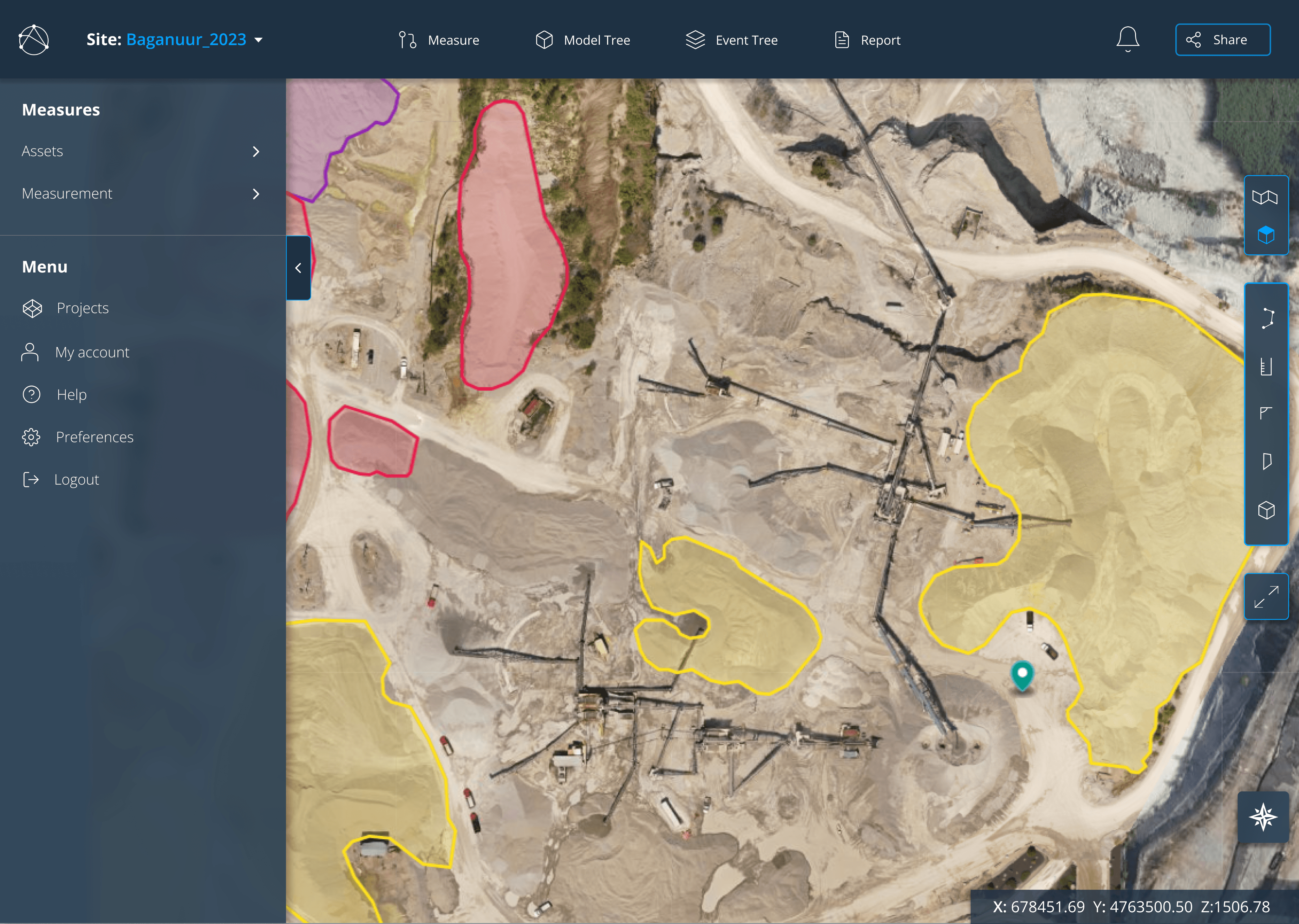
Methods used: Consistency Inspection -> Design walkthrough
Challenge: Brainstorming ideas to reorganize and relocate features.
Result:
Folder management improved organization for users.
Relocating sidebar features to the top increased usability and freed up space.
Users found accessing files through multiple steps unsatisfactory.
Placing the menu to the left sidebar caused some trouble.
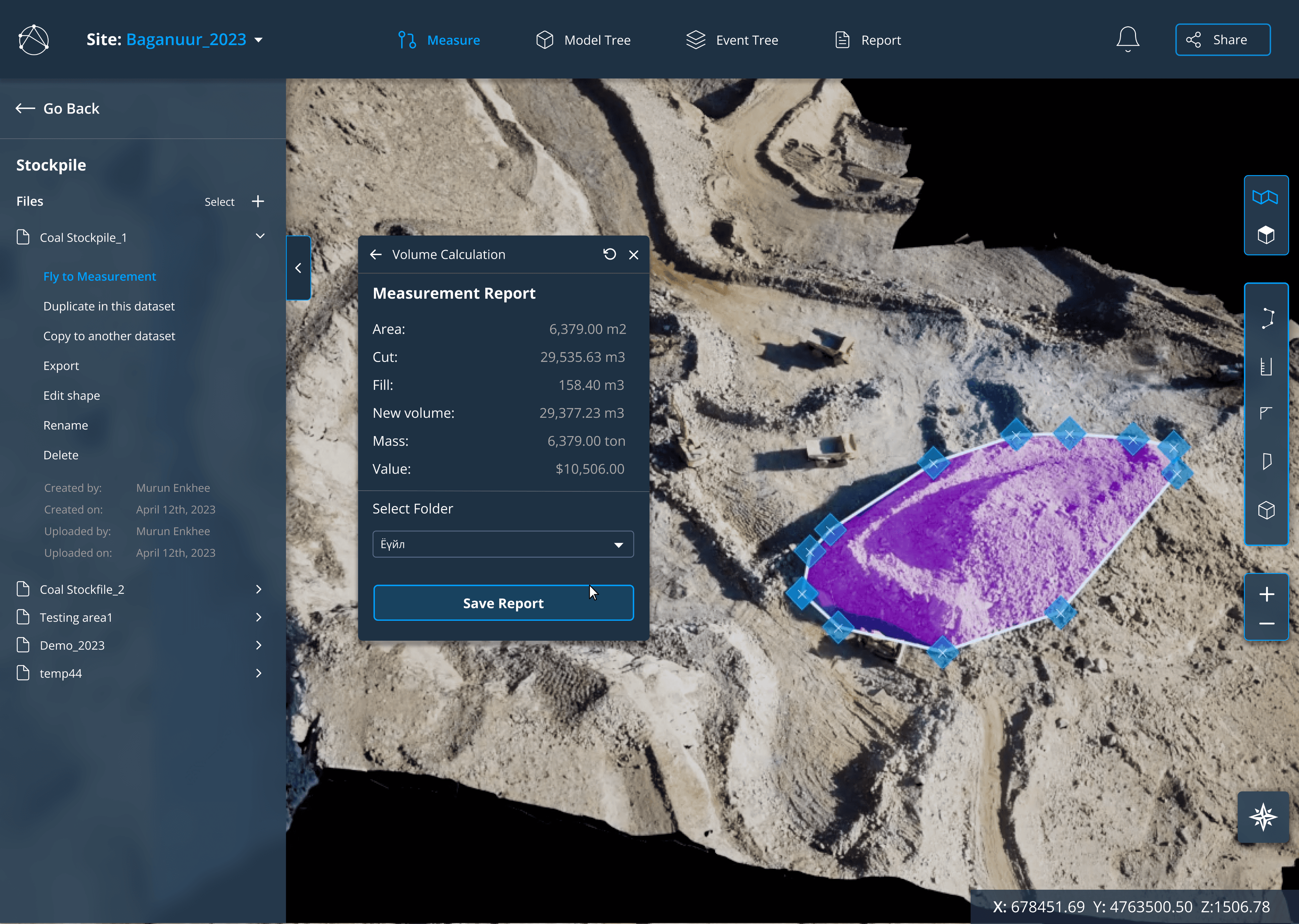
Methods used: Usability Testing -> Design walkthrough
Challenge:
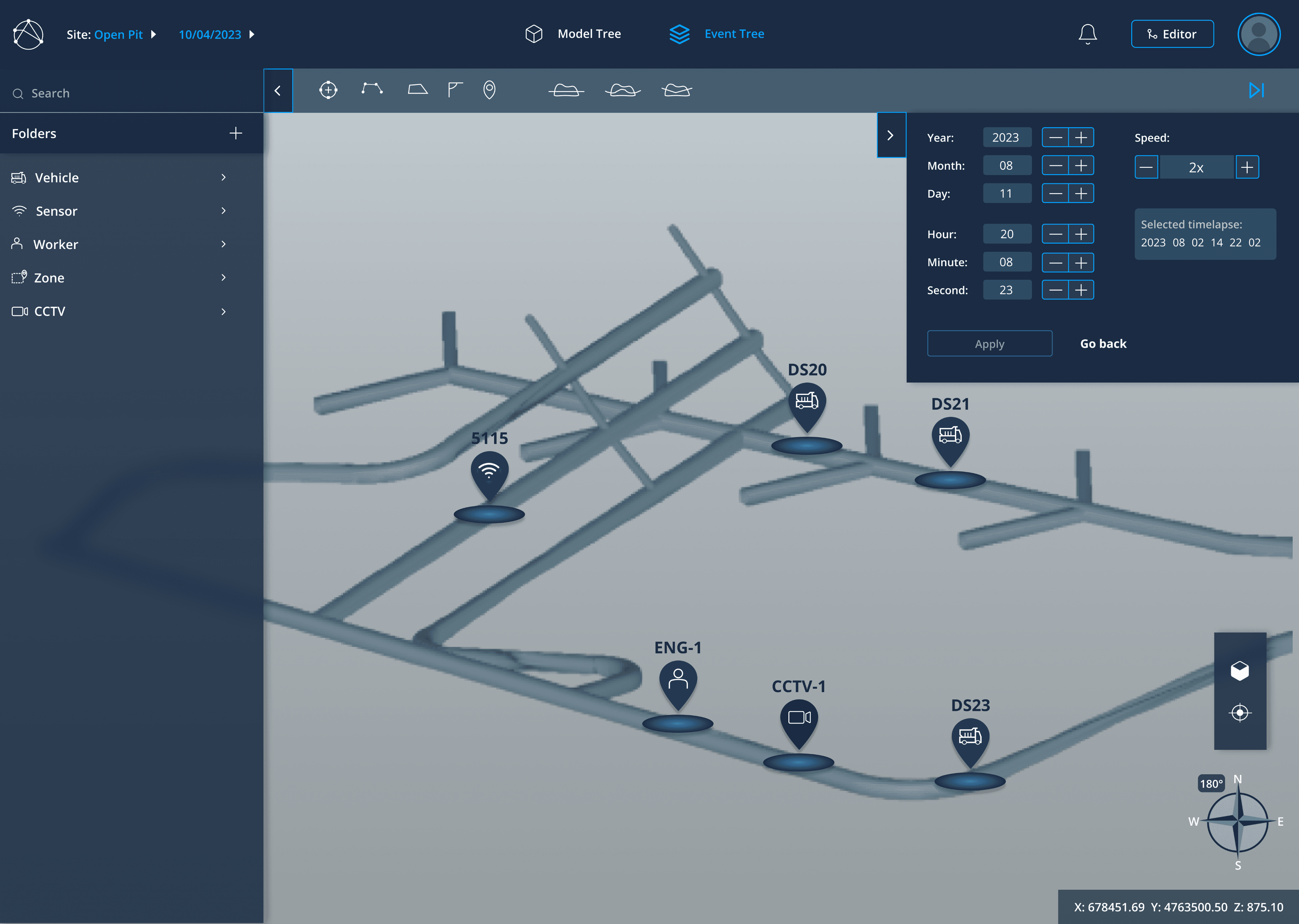
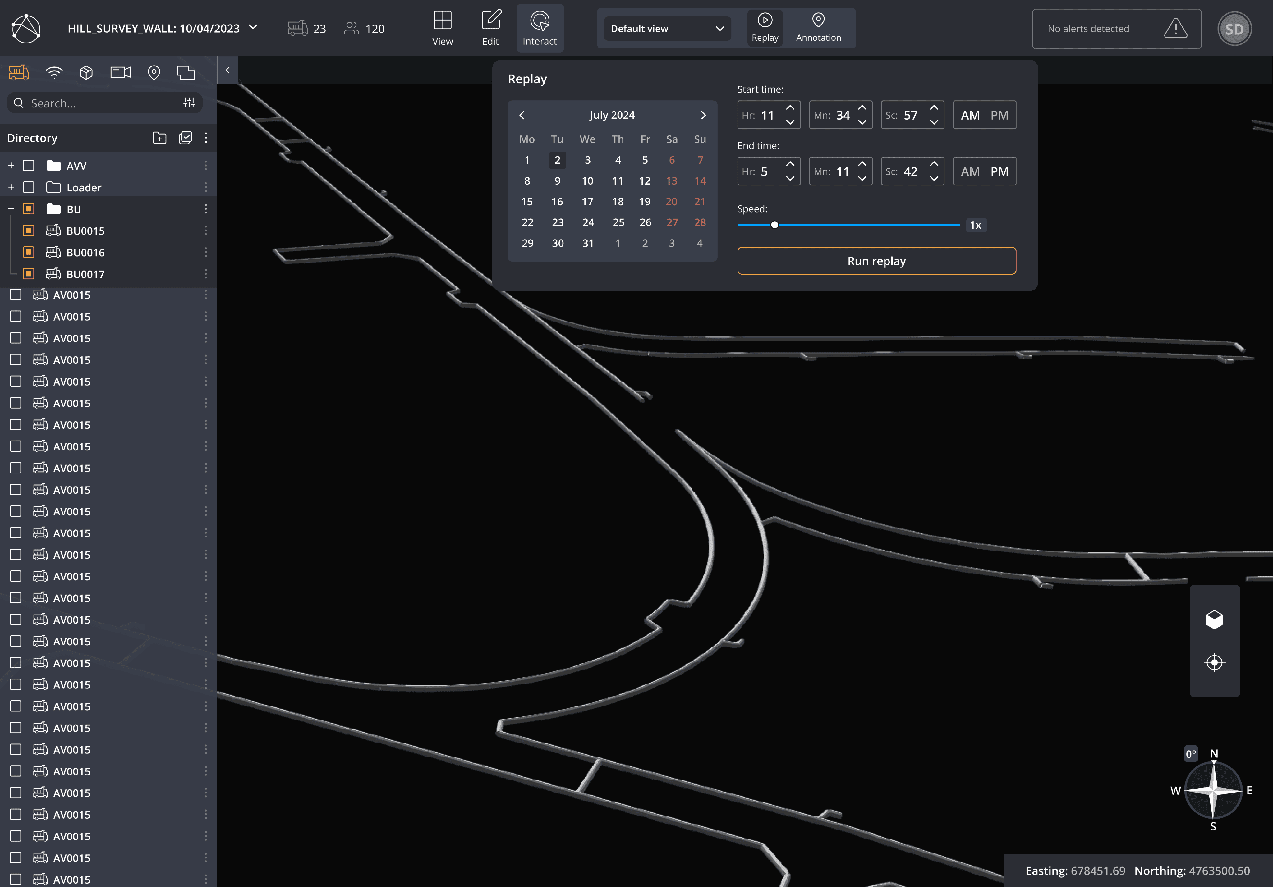
Designing an intuitive time-lapse feature with full date, time, seconds, and speed details was puzzling to implement.
Some features were not able to be implemented in code.
Result:
Folder management is more organized with better structure.
Moving the user profile section to the top bar improved usability for users.
Some of the added feature’s icons were confusing to interpret for some users.
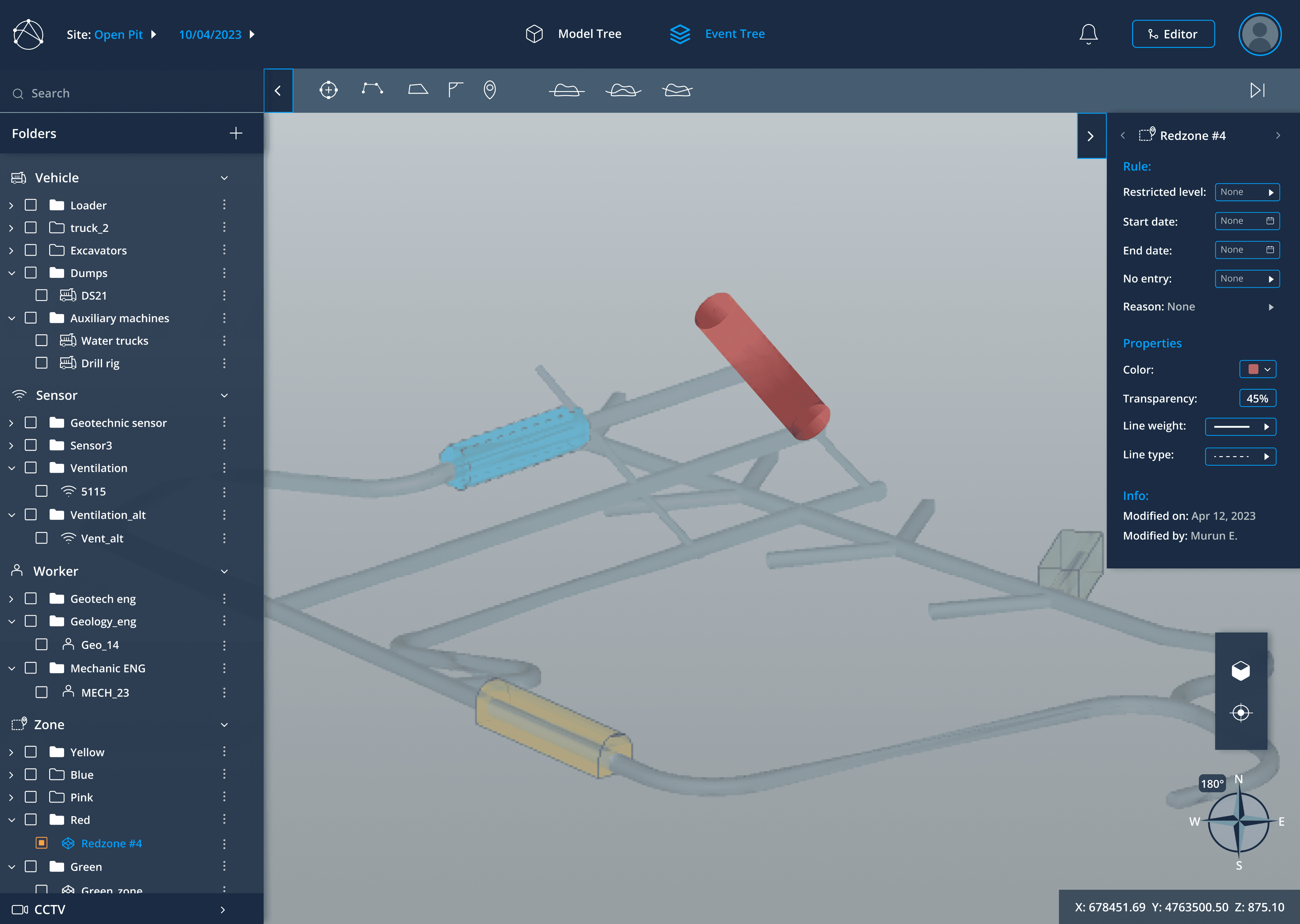
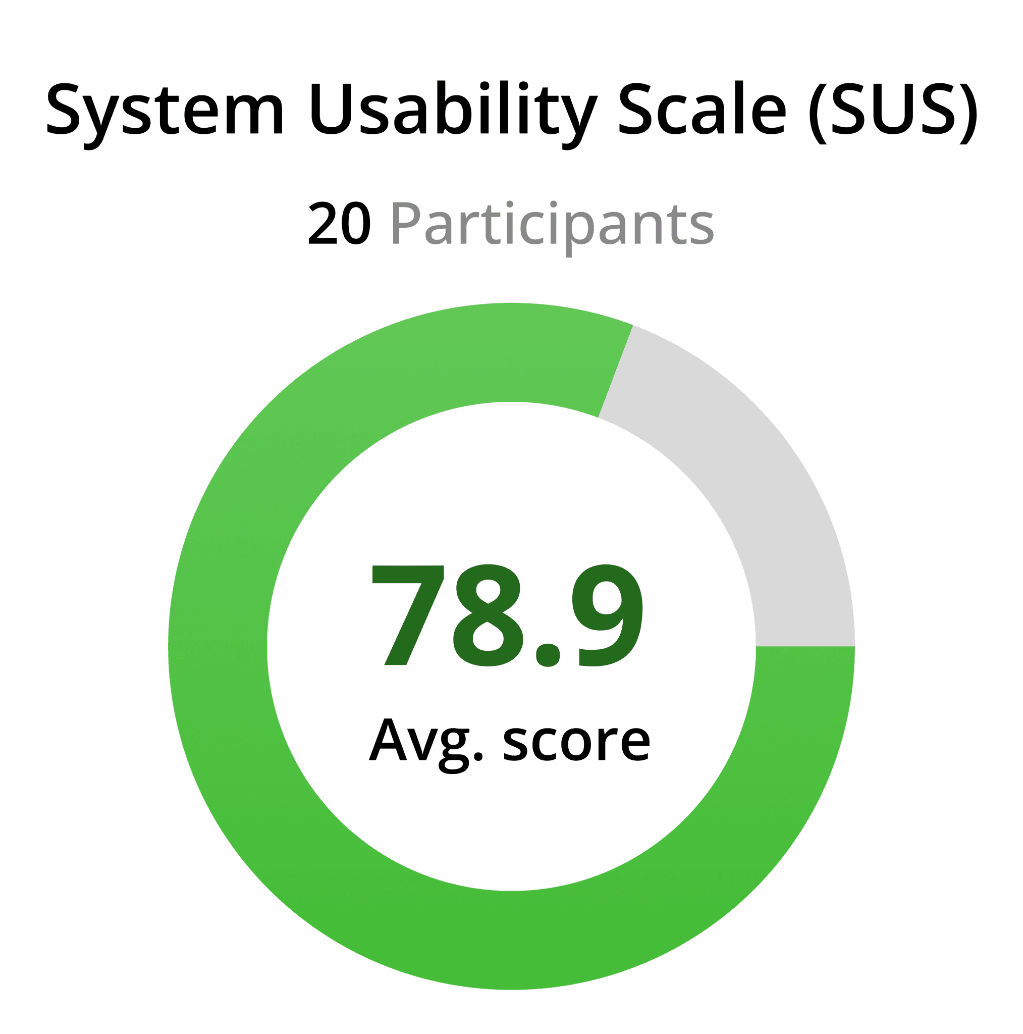
Methods used: Information Architecture -> User Survey -> User Interview -> Usability Testing -> Design walkthrough
Challenge:
It took some time to transition to a completely new interface and experience due to user needs and strategic direction.
The structure and layout of the new features proved challenging.
Evaluating which features are feasible for development based on our goals from end users' wishlists.
Applying accessibility regarding user interface color scheme.
Result:
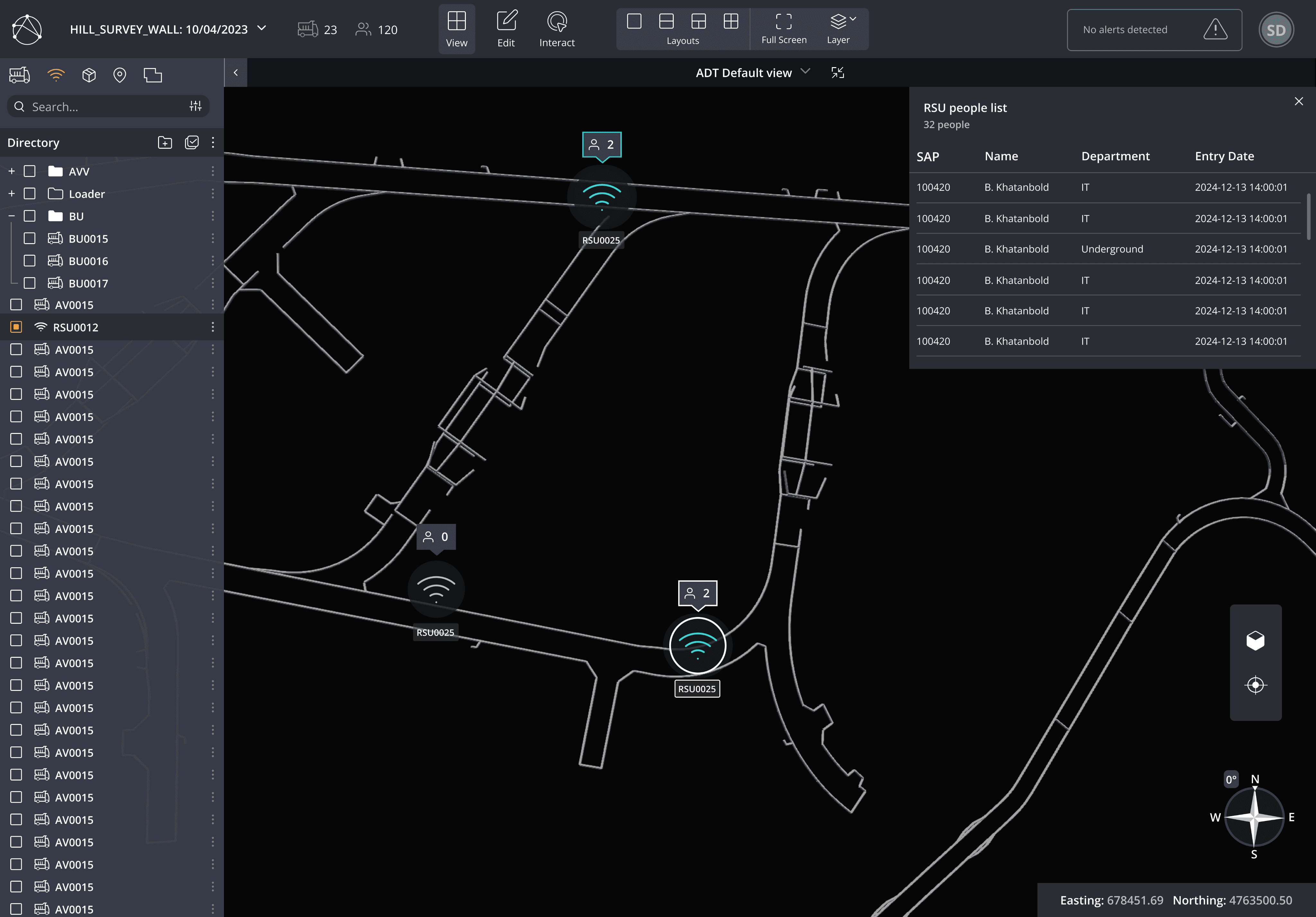
Easy access to navigation and features.
Users were satisfied with the improved UI.
Users were able to accomplish their goals with minimal confusion
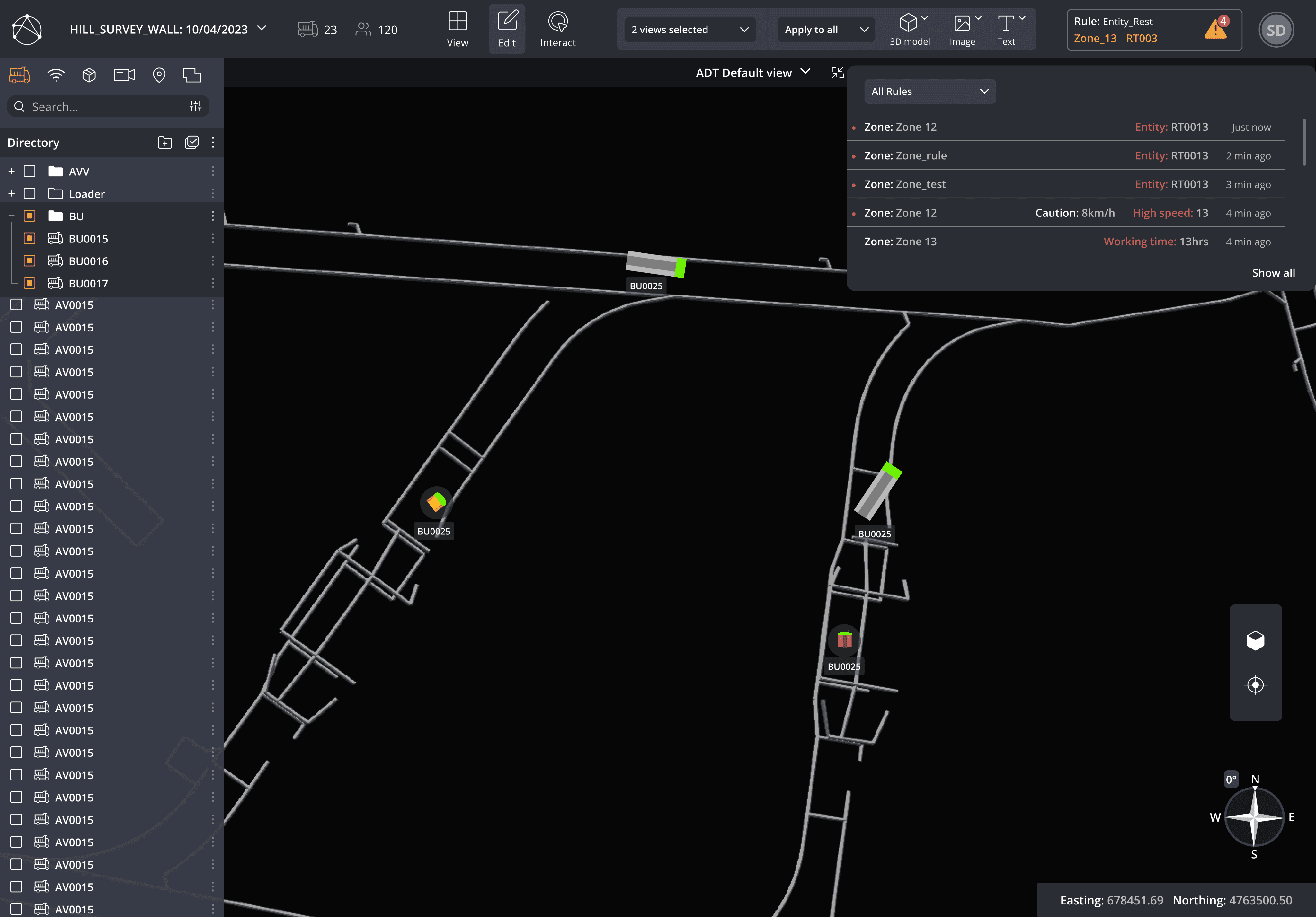
Applying distinct colors to create the right feel for each function
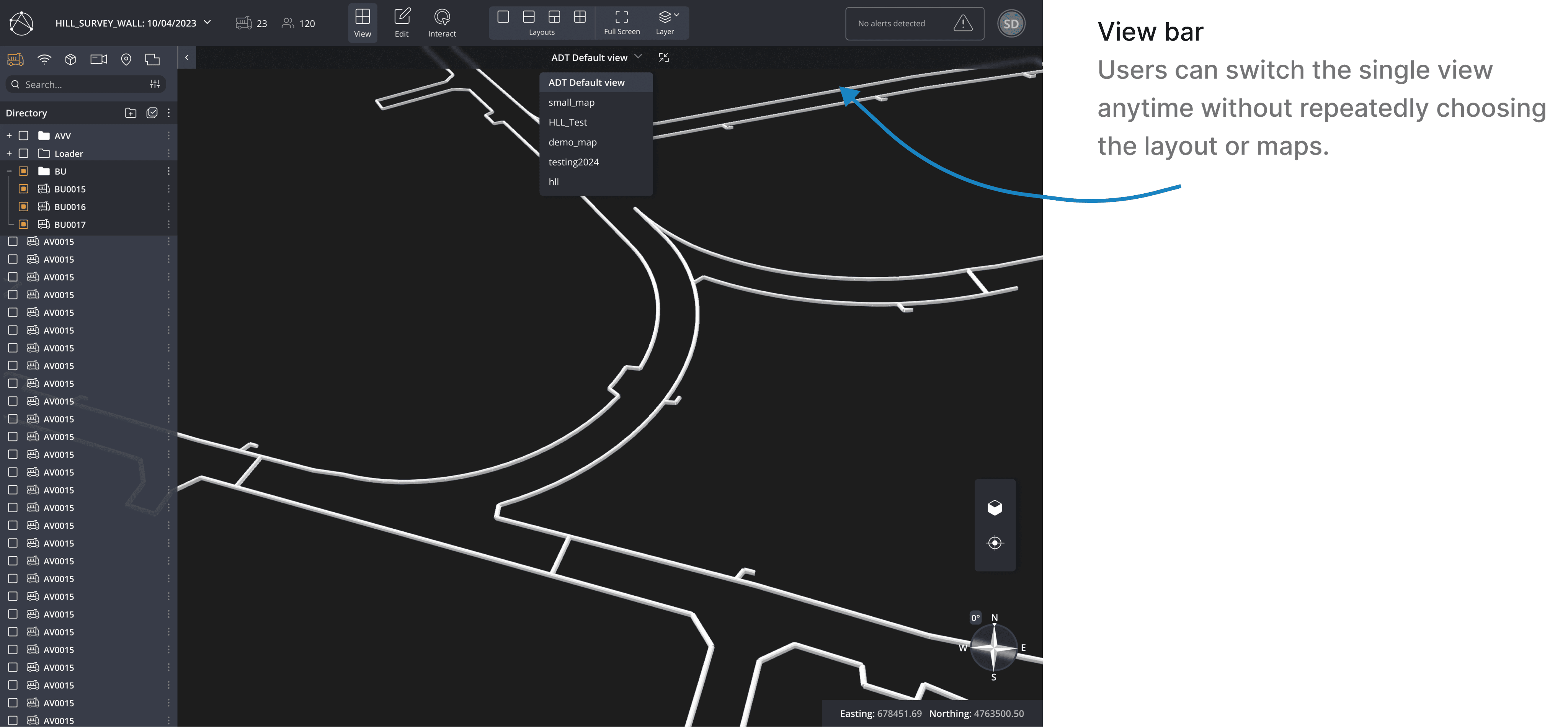
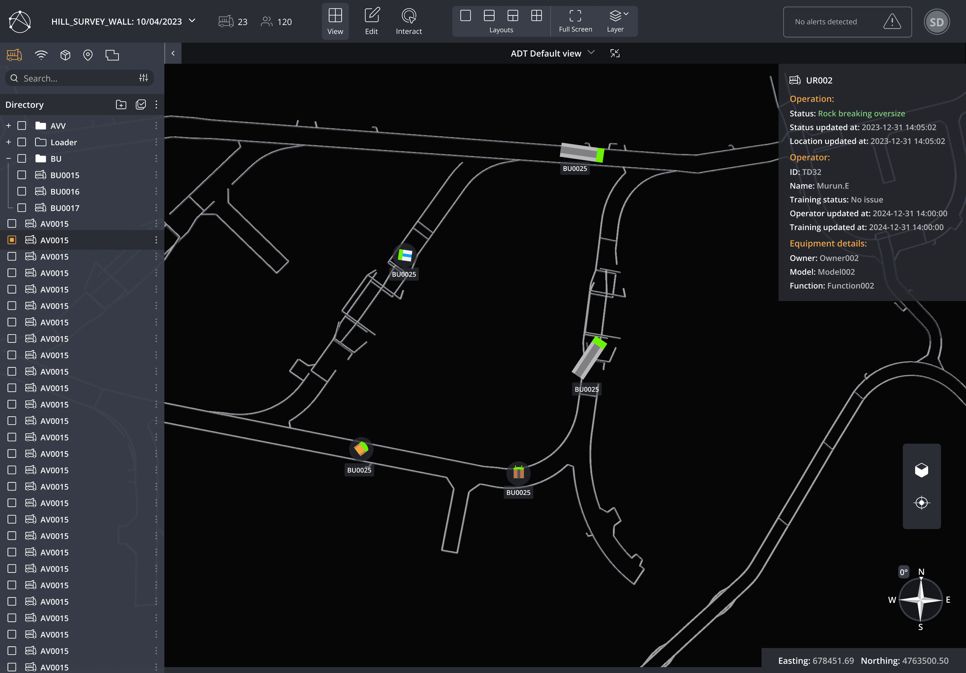
The view bar changes into the respective bar when the user selects a certain feature.
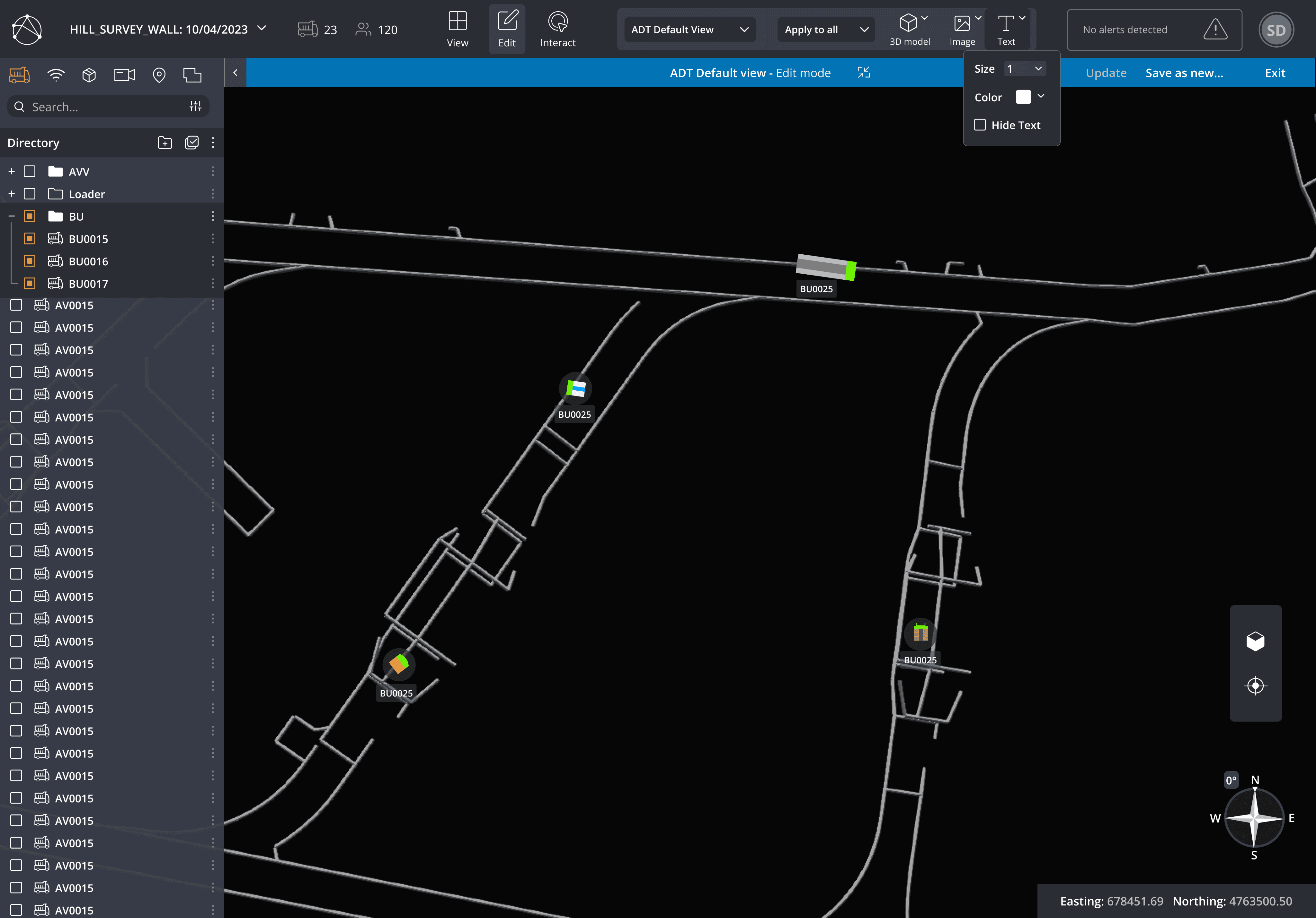
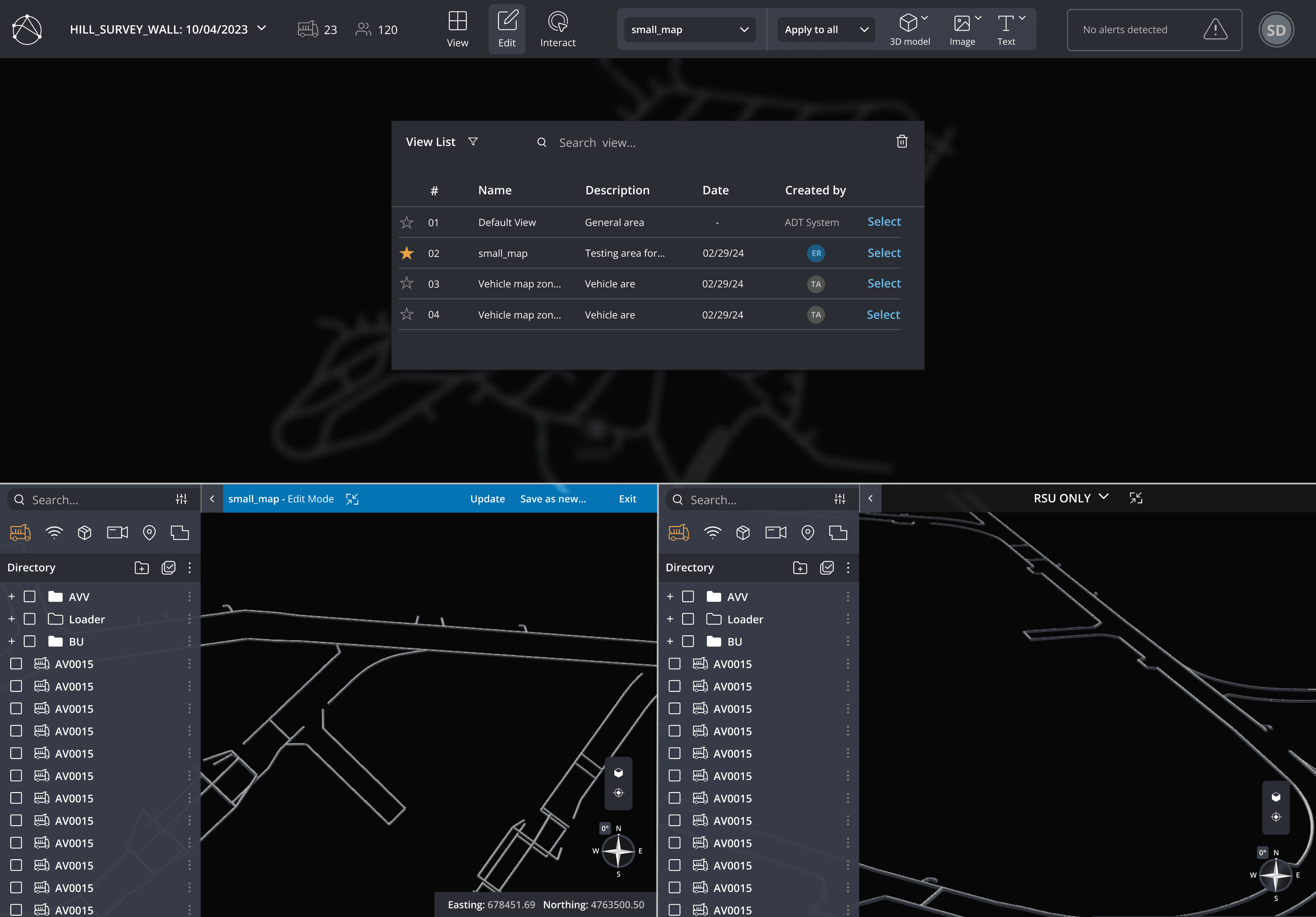
Changes to a blue bar when "Edit" is selected
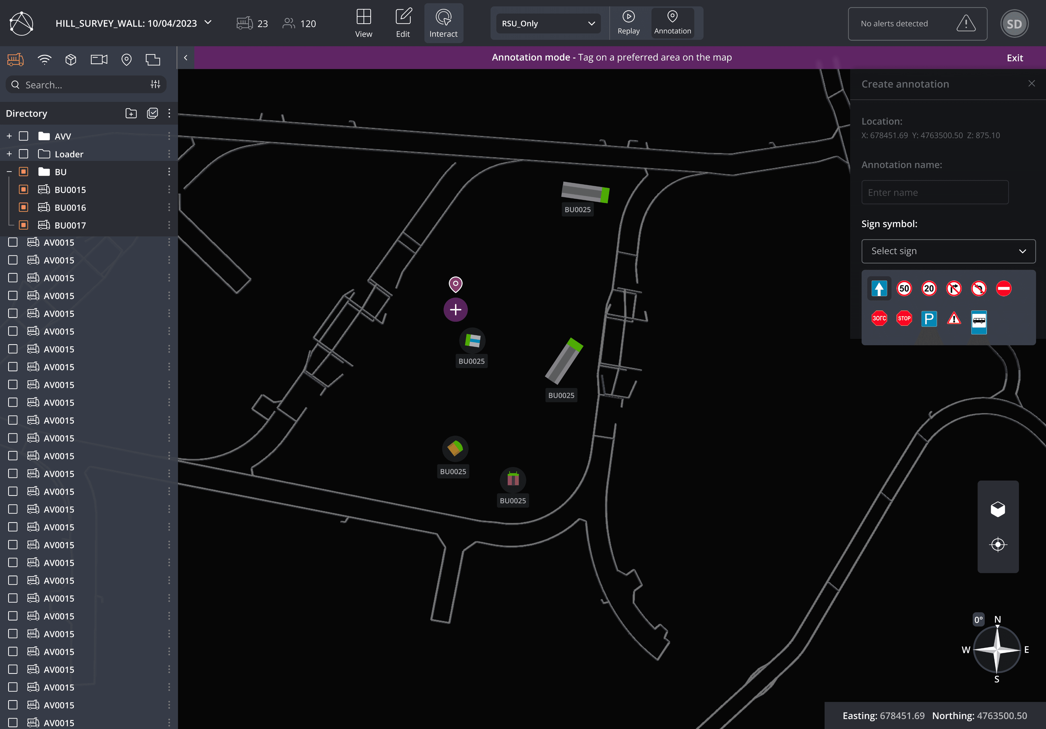
Changes to a purple bar when the user wants to annotate road signs on the map
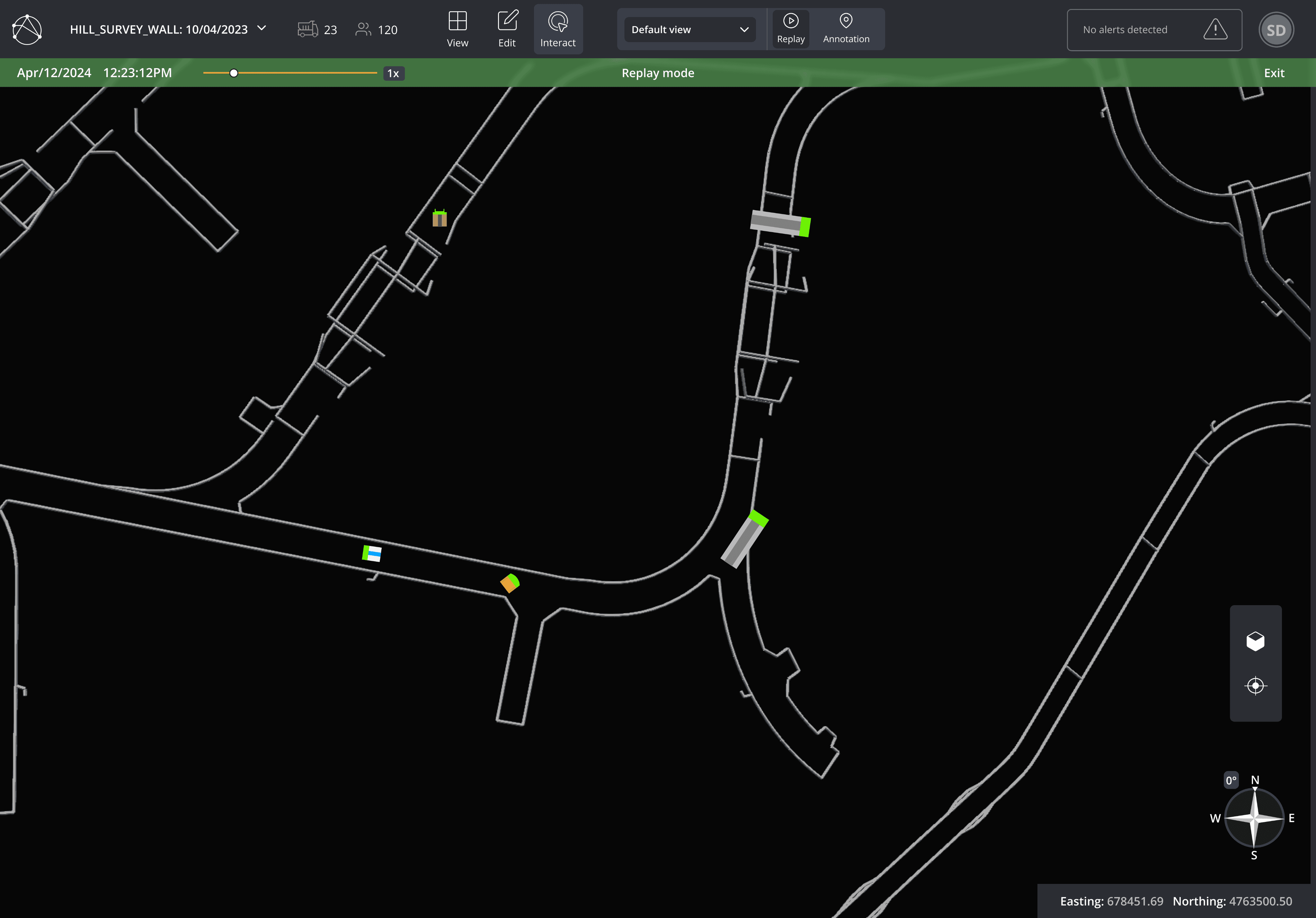
Changes to a green bar when user selects the time-lapse feature to view previous actions
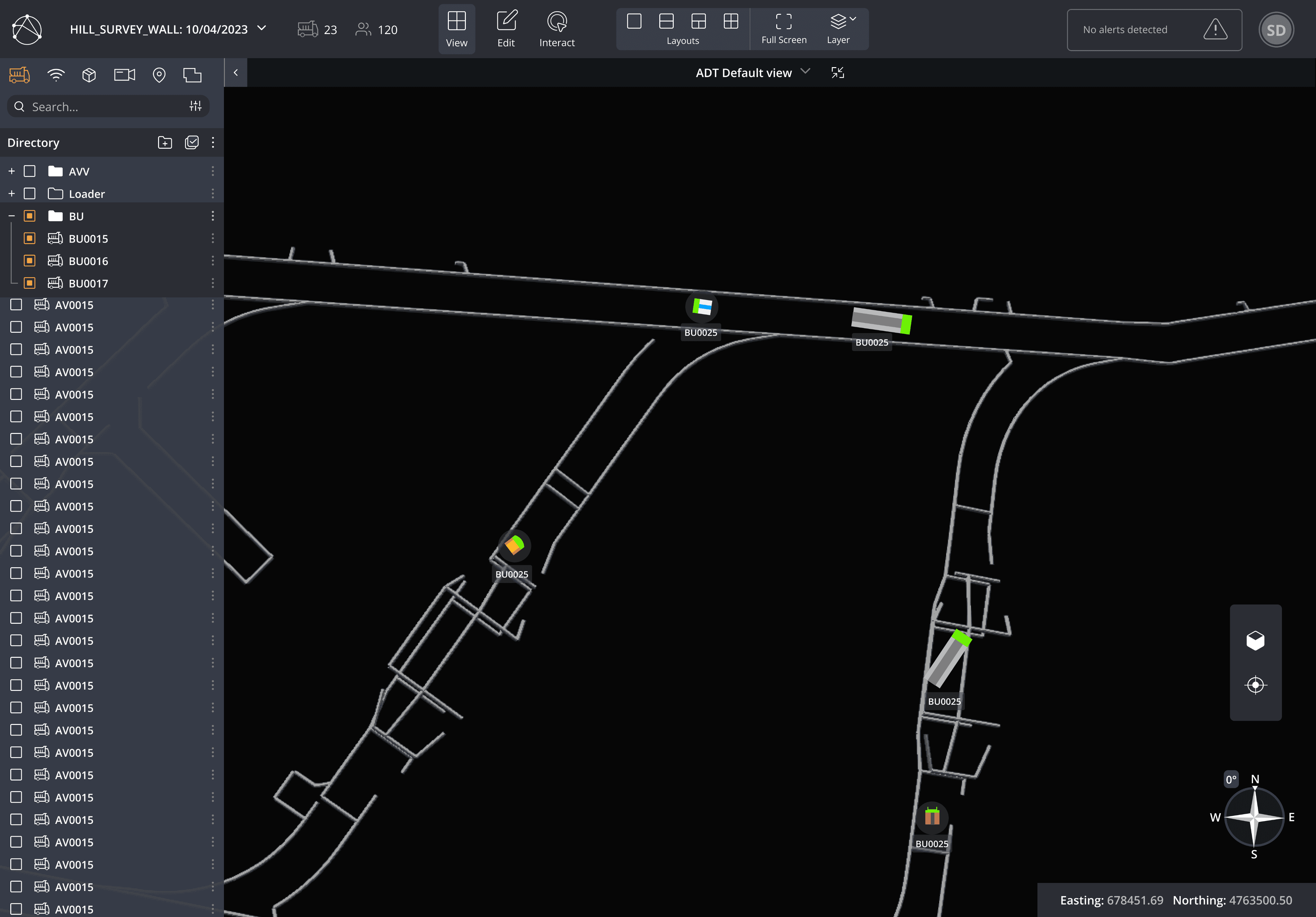
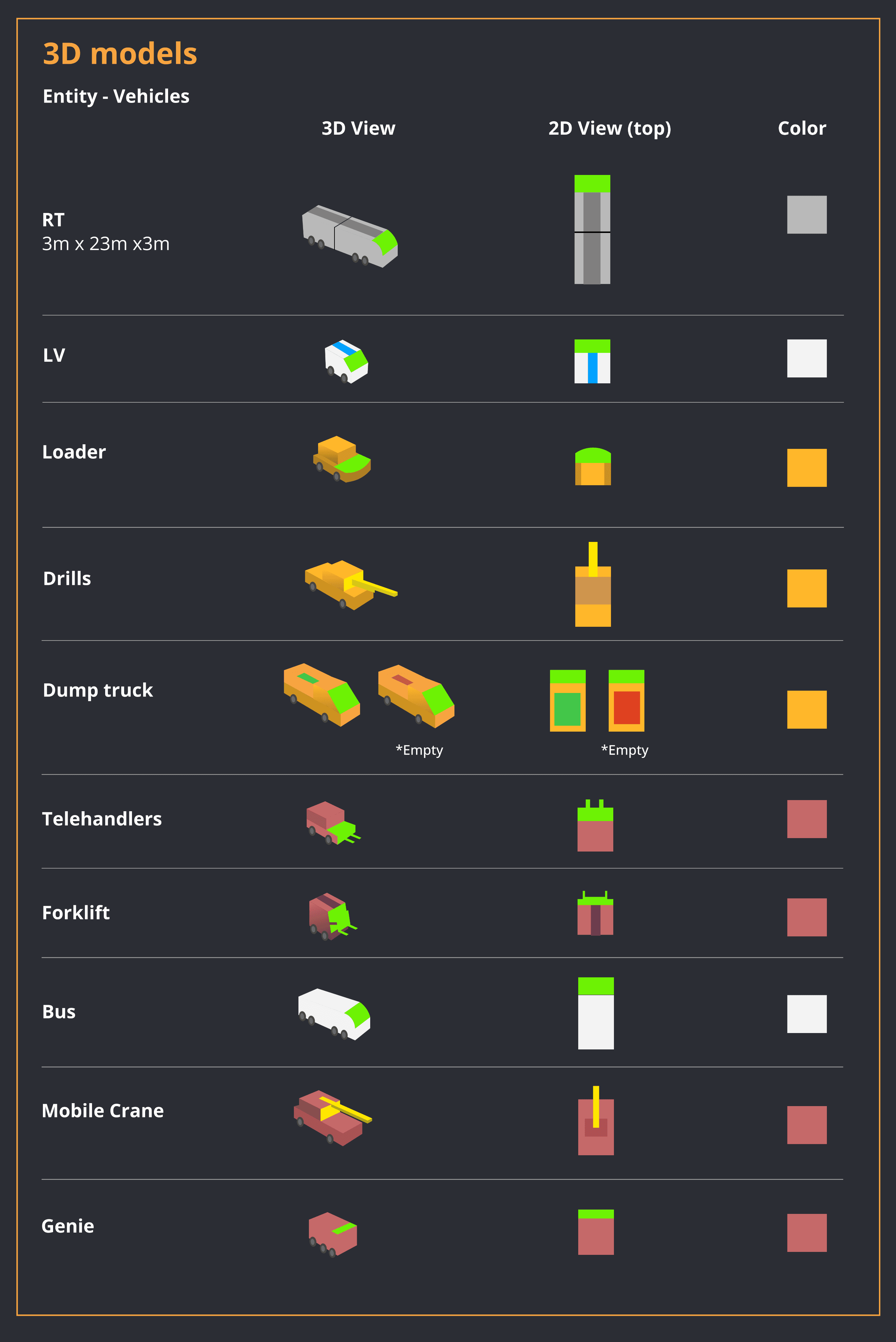
3D Vehicle models
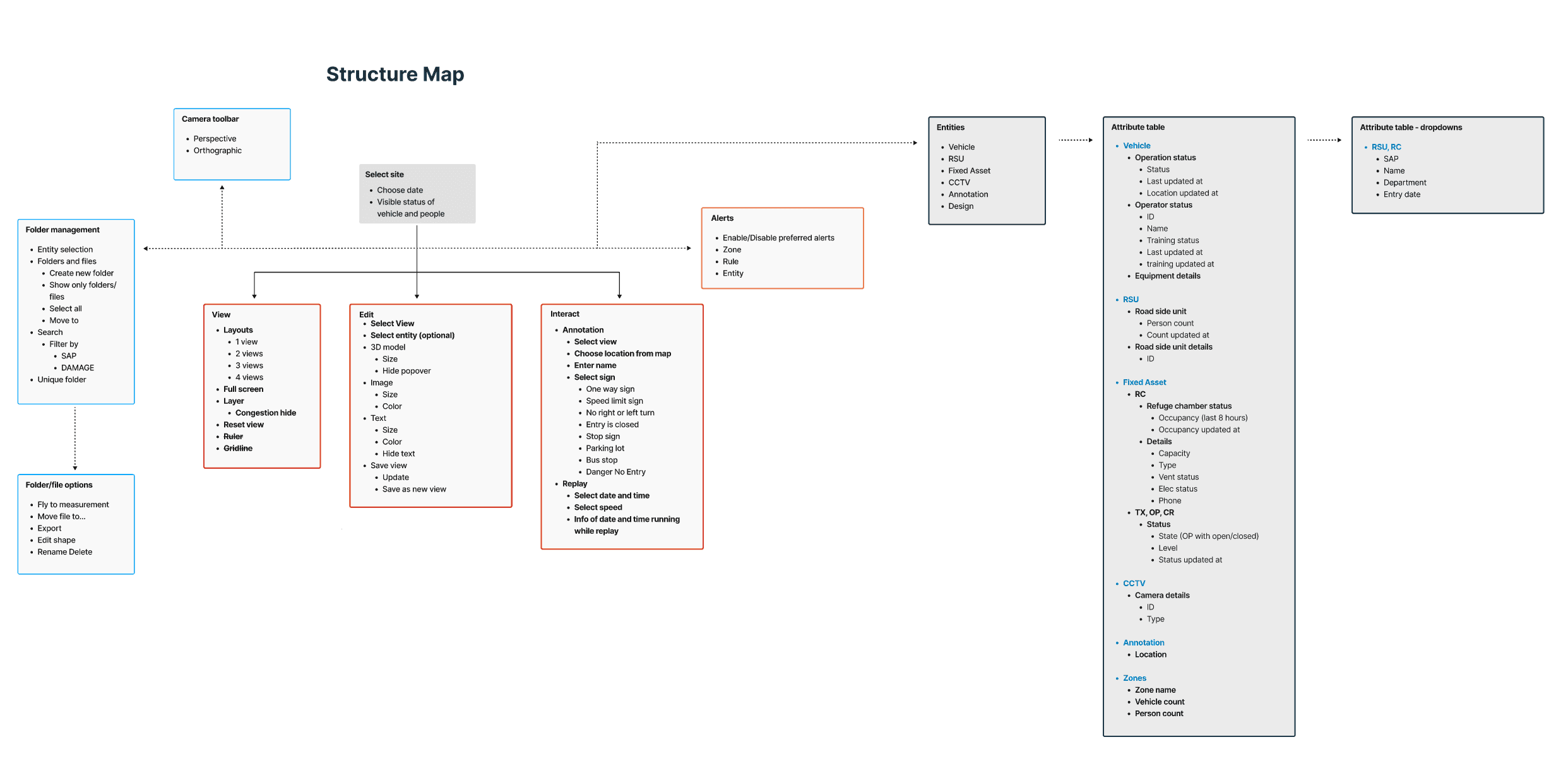
Updated Information Architecture
EDIT SITE
Customizing objects for preference
TIME LAPSE
Replay and view previous options
ANNOTATIONS
Placing road signs on map
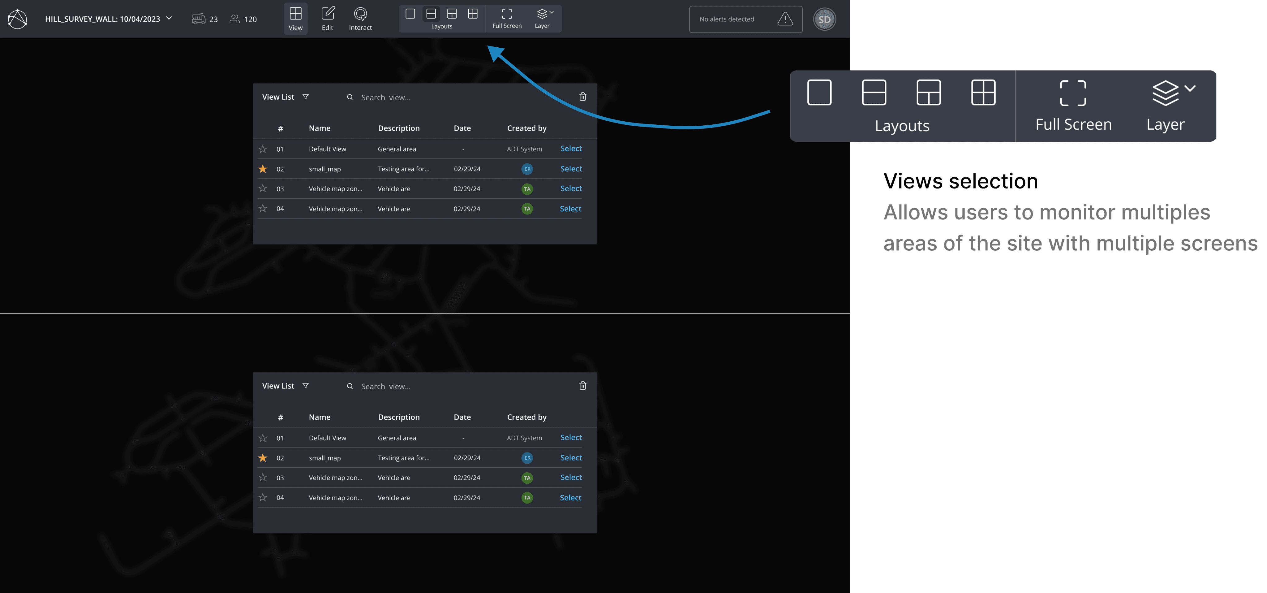
SPLIT SCREEN
View and manage multiple operations
ATTRIBUTES TABLE
View detailed info of objects
ALERTS
Notification of any incidents on map
See other projects
