Credits to team members
The product primarily targets vehicle operators, specifically excavator and dump truck drivers


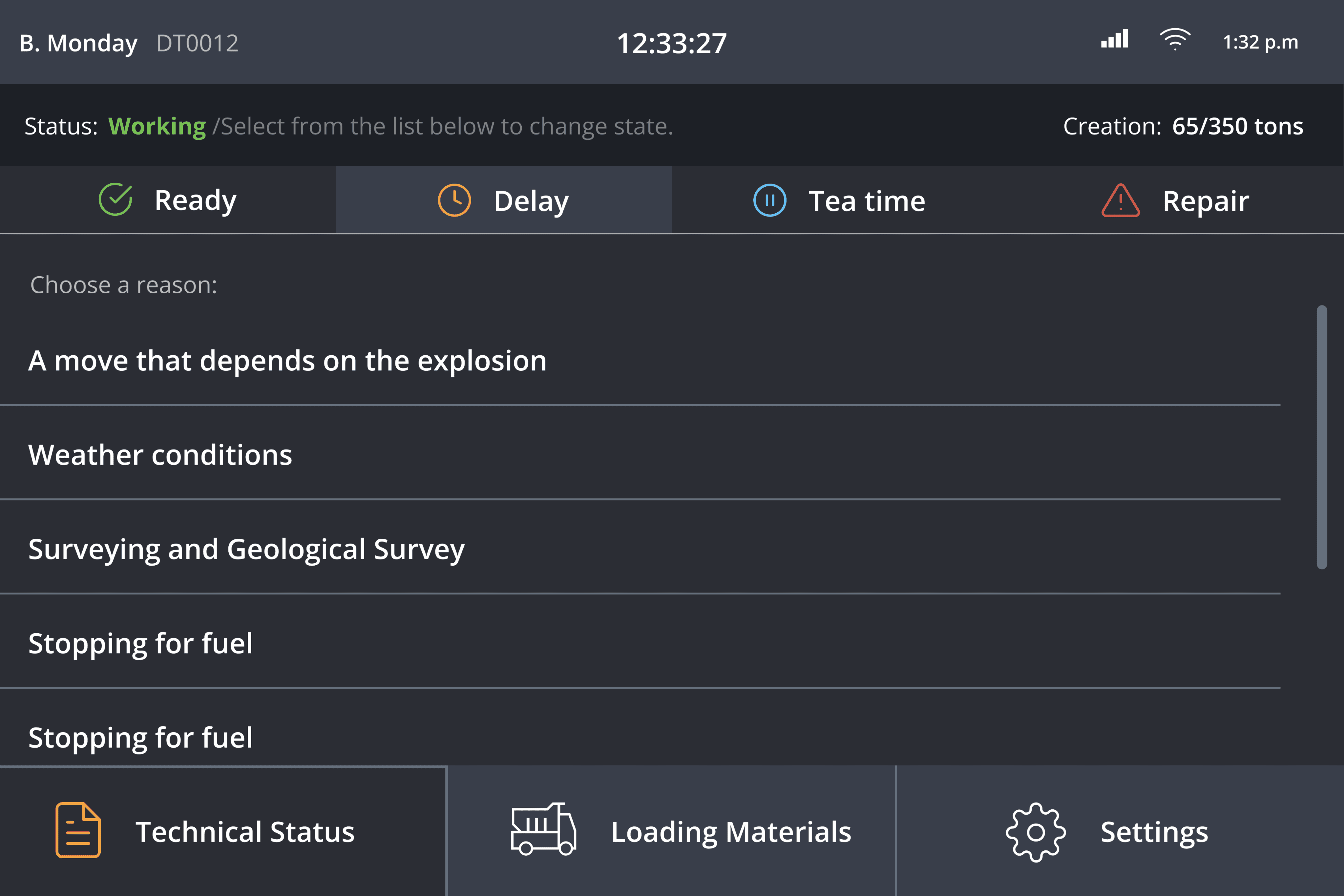
To craft this app, thorough research was conducted to identify key features, leading to an initial design with basic status options for operators.
Methods used: Brainstorming with the team -> User Interview -> User flow -> Usability Testing
Challenge: With only one company as the client, testing and research opportunities were limited and lacked diverse feedback.
Result:
End-users found the text too small, making it difficult to read while driving.
The current status display was small and difficult to recognize, even though it’s the app’s most important feature.
The status buttons were relatively small for driving operators.
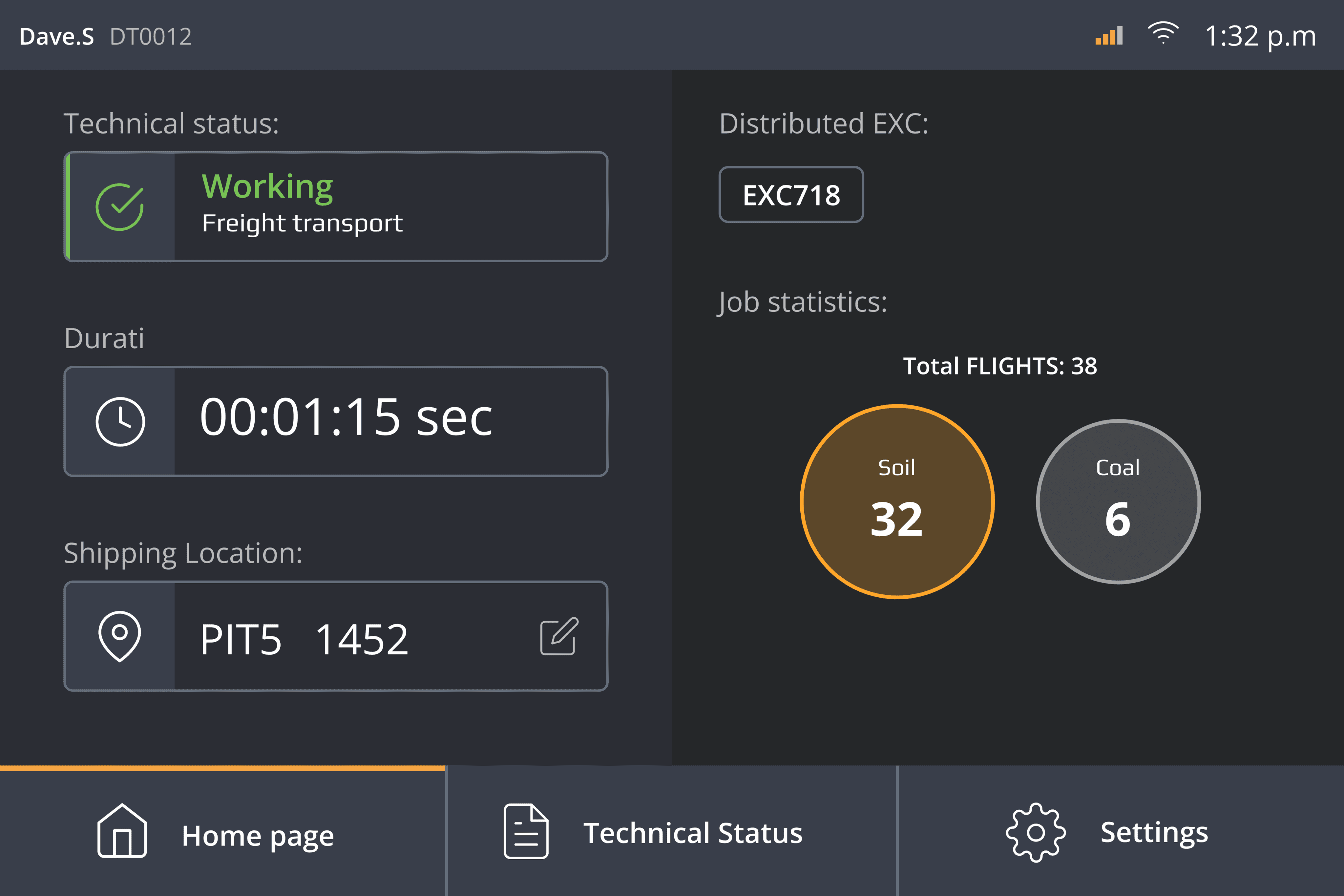
Based on feedback from the first iteration, several UI and layout changes were made to enlarge the current status display and increase text size for better readability.
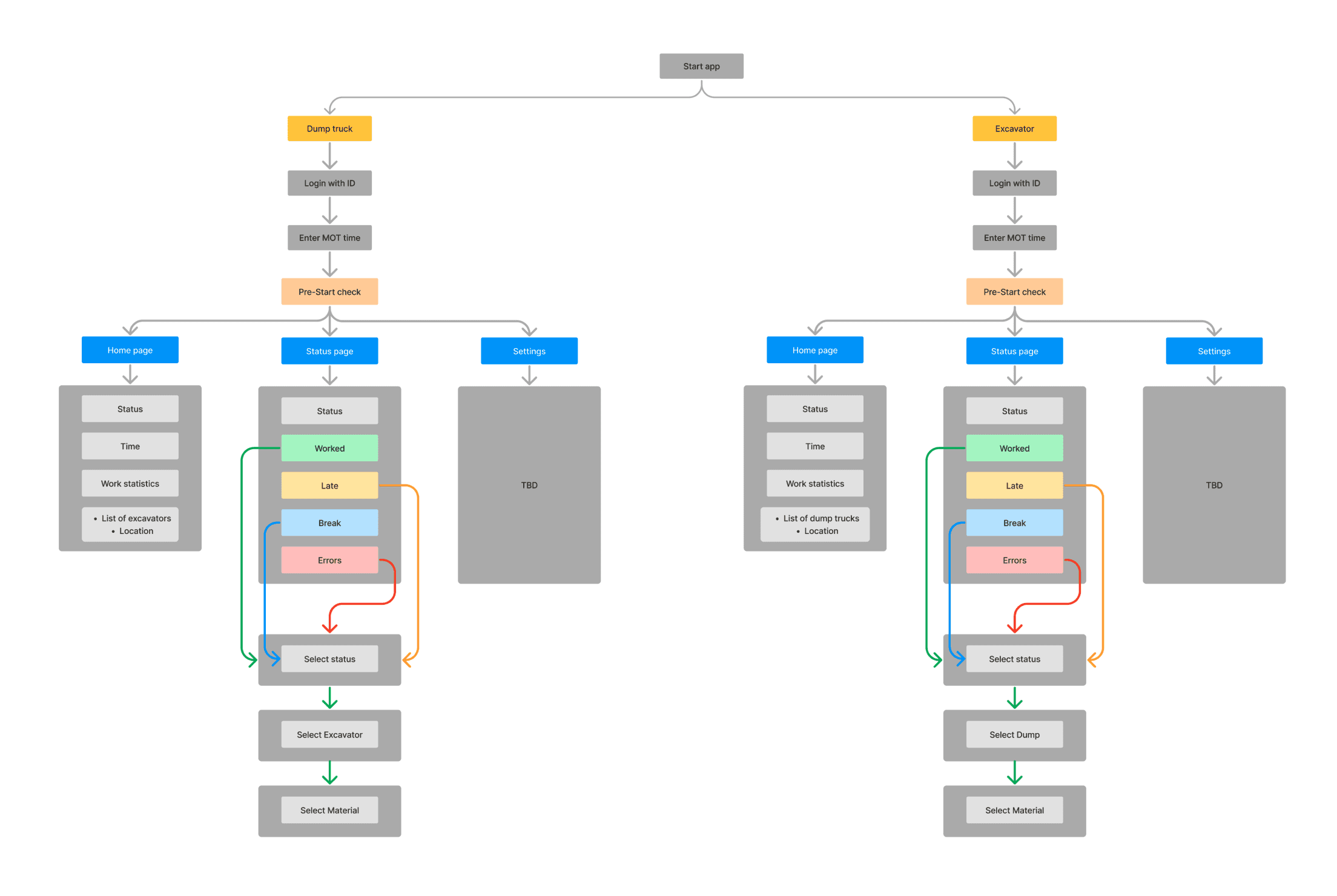
Methods used: Information Architecture -> Design walkthrough -> Usability Testing
Challenge:
Increasing the size of the status display and text took more screen space, so balancing readability with functionality was important to avoid an overcrowded interface.
Expanding certain UI elements required similar adjustments on other components for consistency, which led to additional design work and testing.
Result:
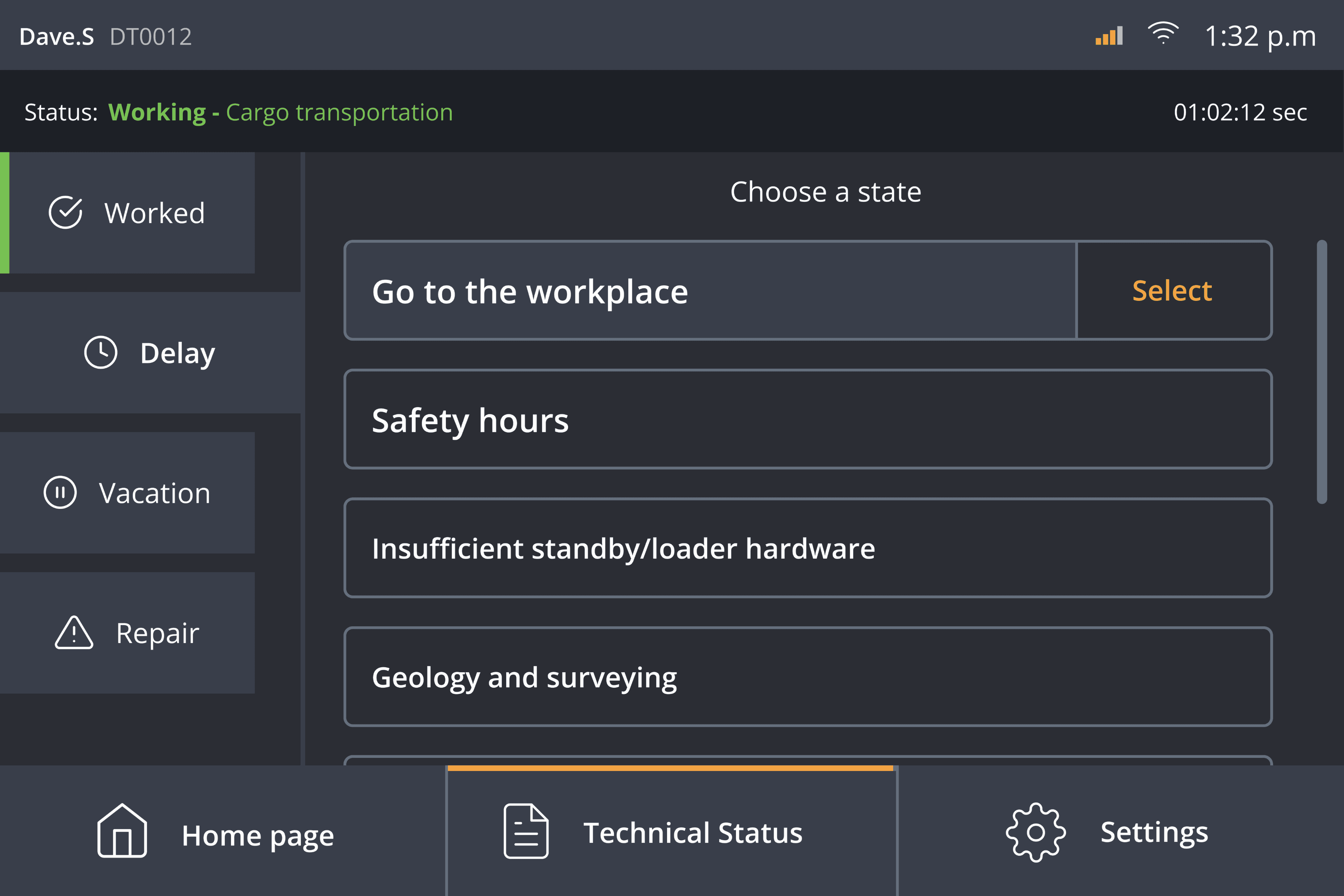
The overall app needed more visual components, as it was predominantly text-based, making it difficult and time-consuming for users who are driving most of the time.
There were too many steps and navigations required for users to accomplish specific tasks, resulting in multiple menu sections that forced users to go back and forth repeatedly.
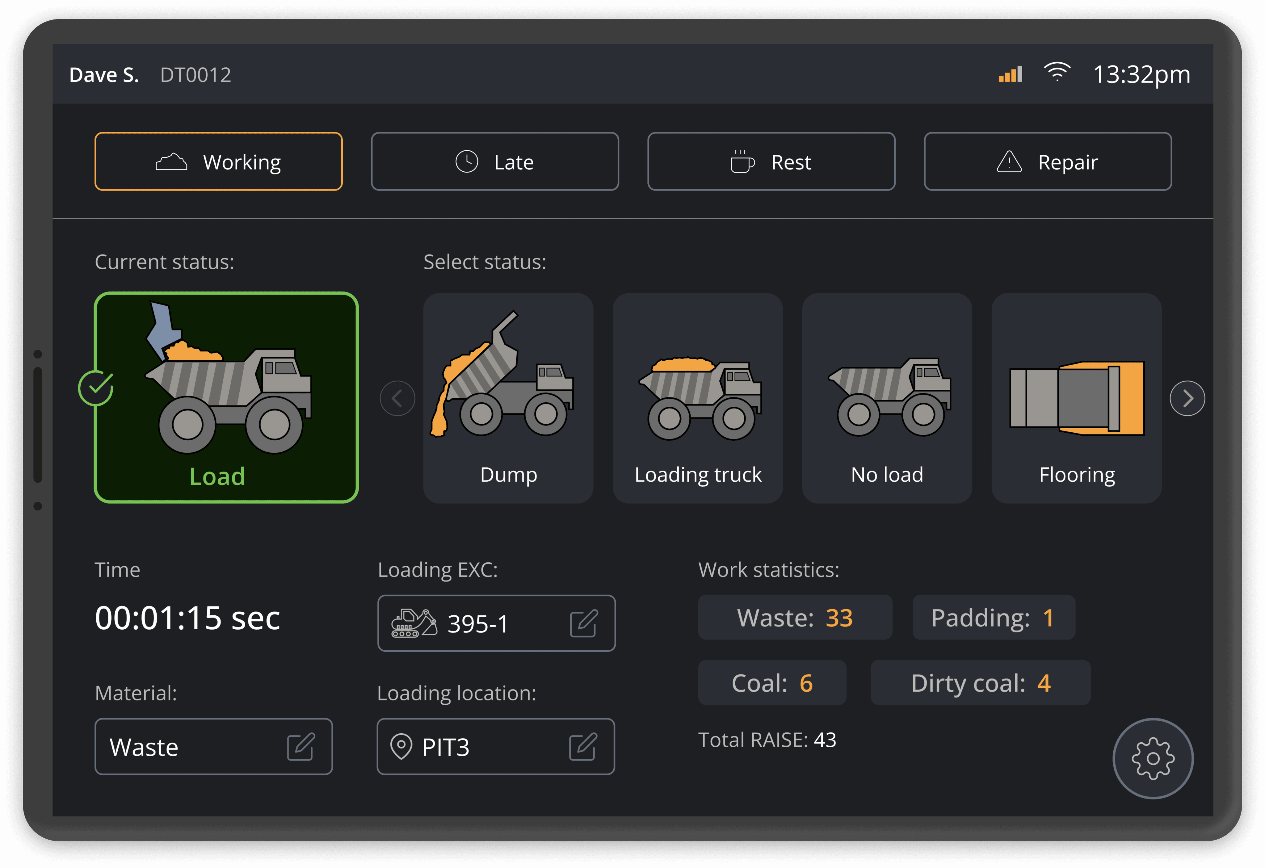
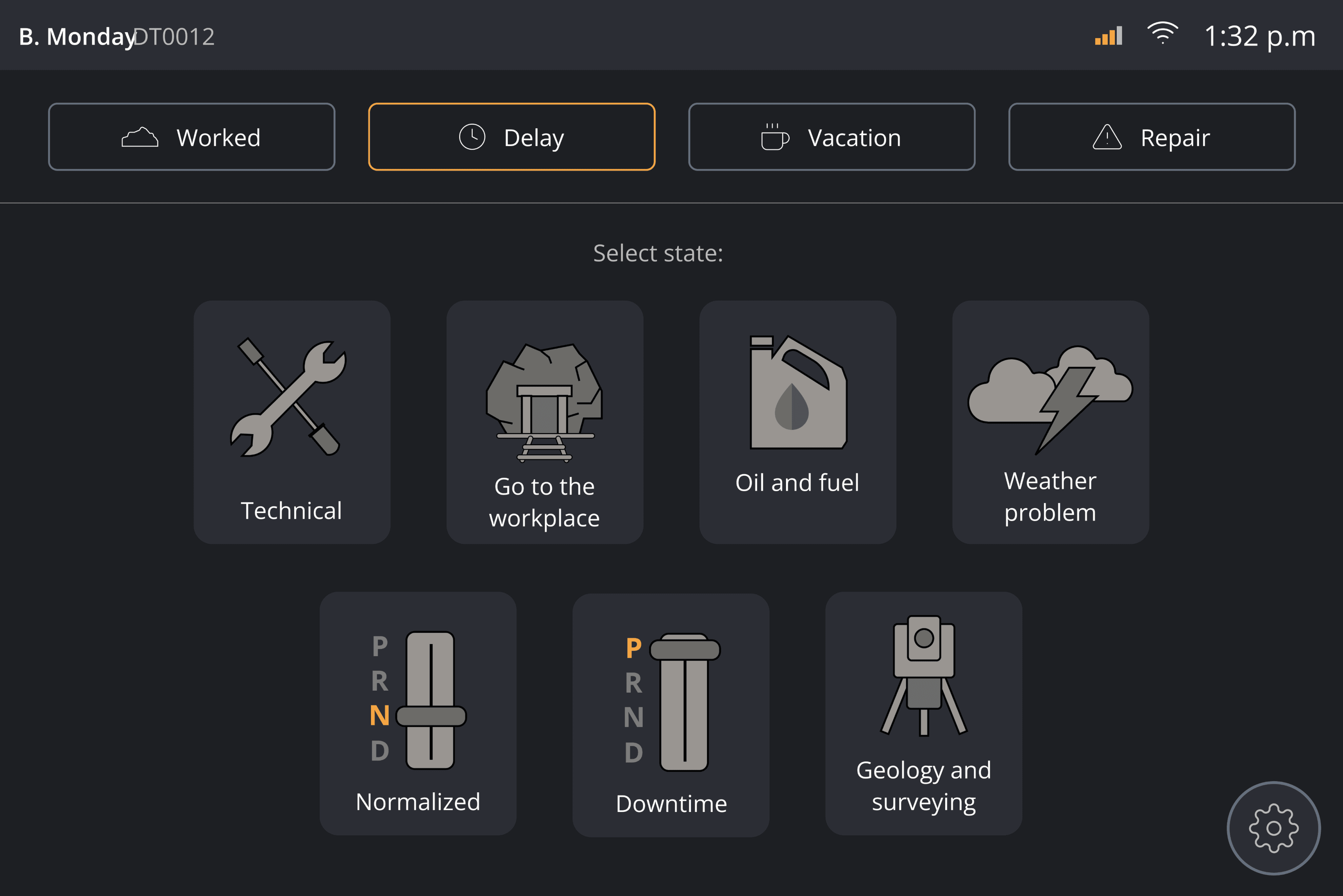
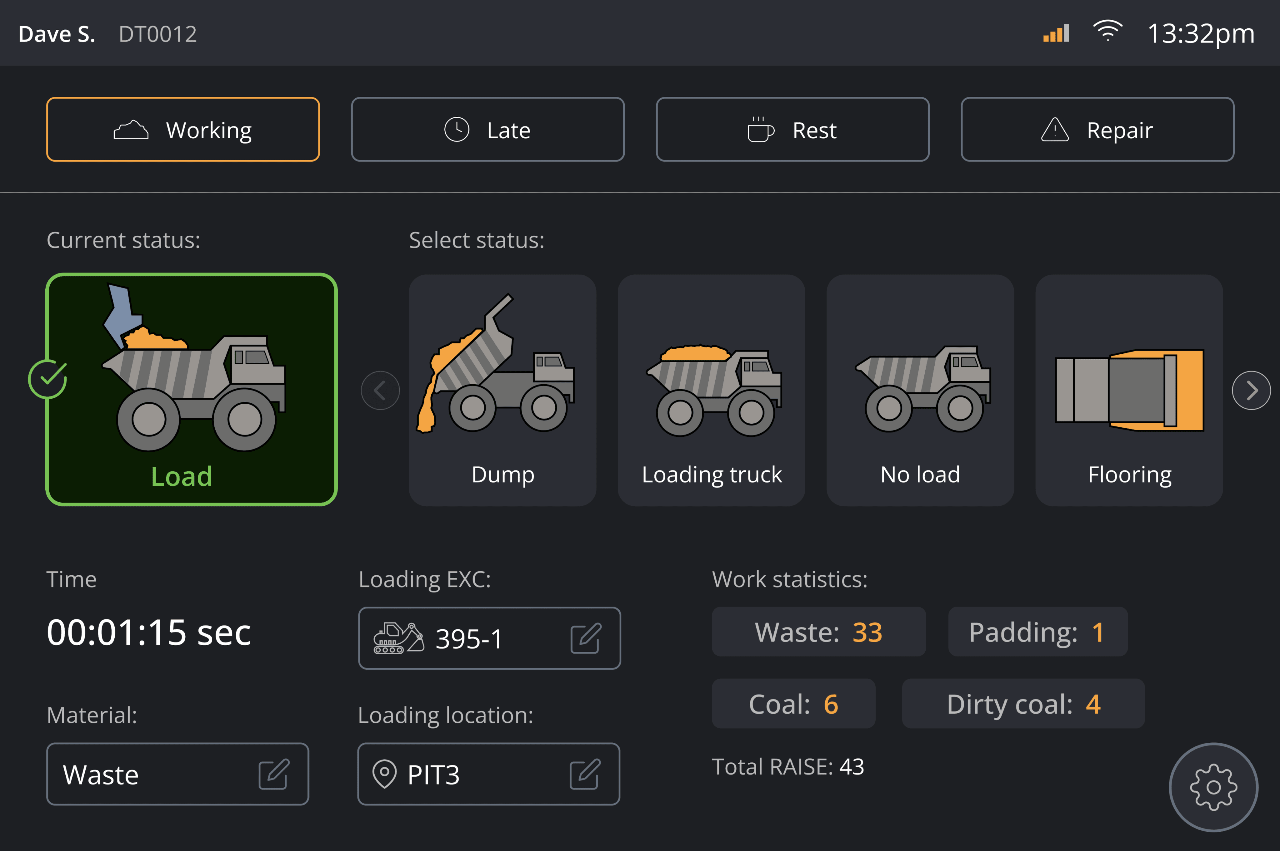
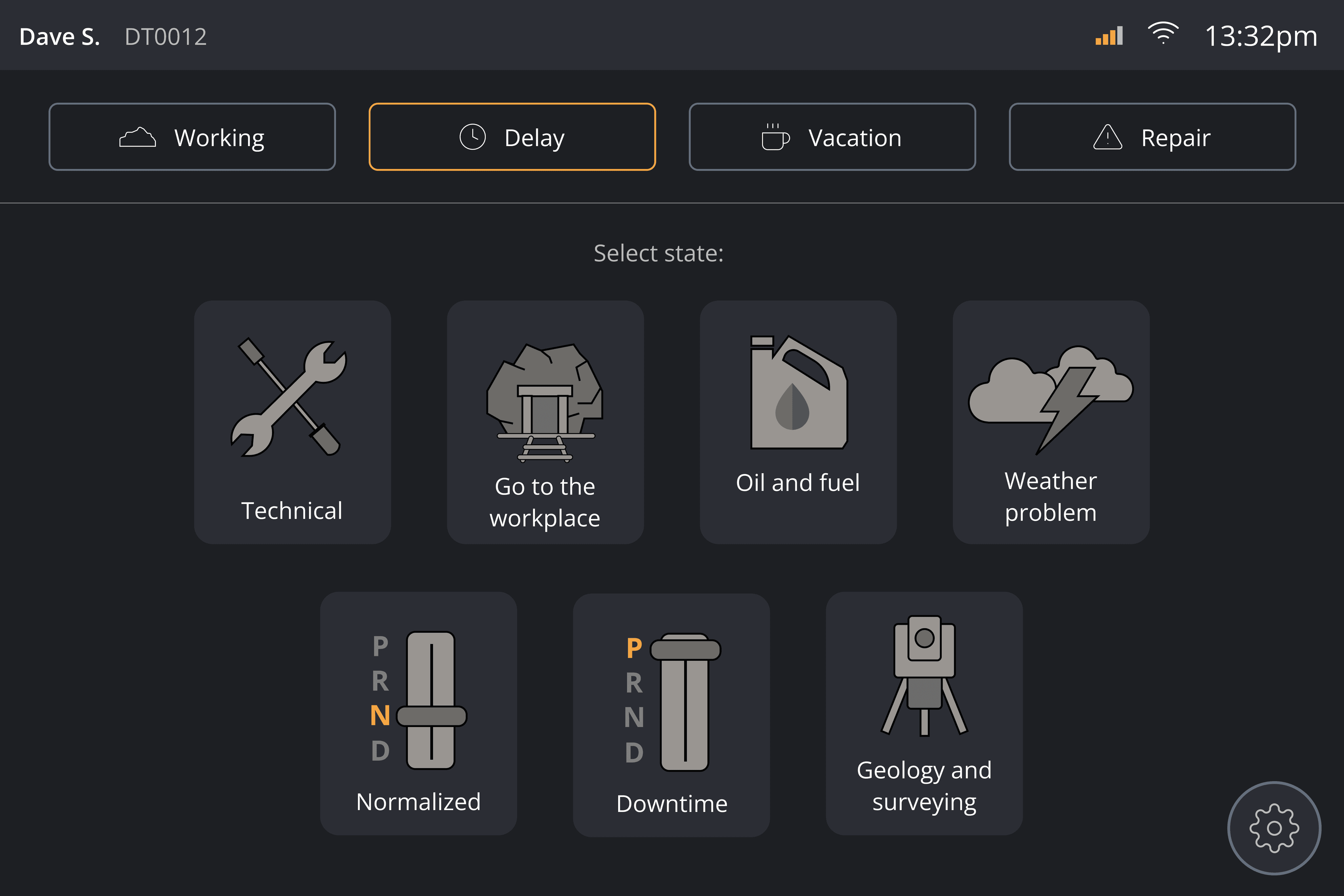
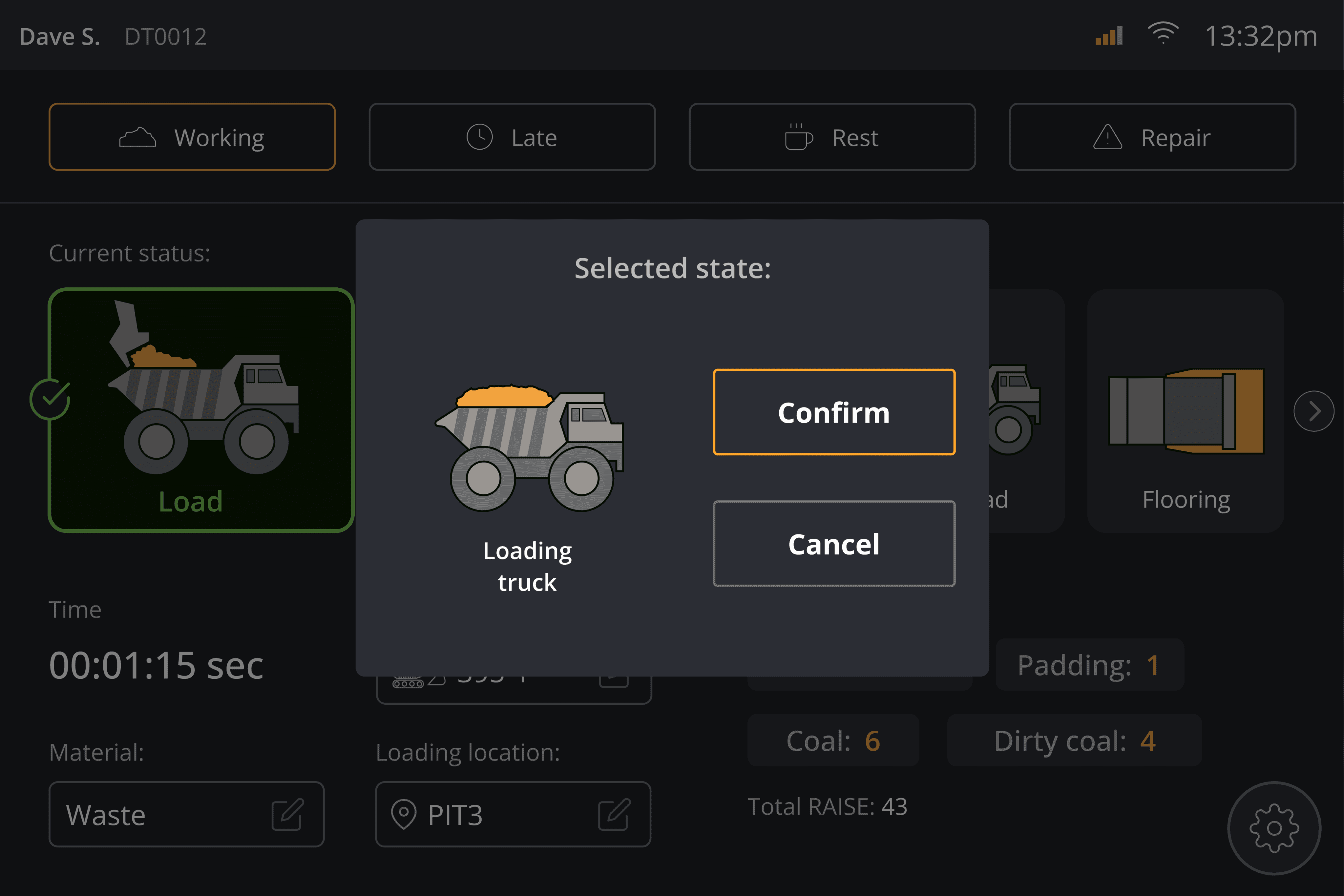
This iteration represented the final delivery, featuring more visual components and fewer navigation steps for enhanced usability by drivers. I chose to design visual icons from scratch, enabling users to quickly recognize and perform tasks without having to read text.
Methods used: User Interview -> Design walkthrough -> Standard Inspection -> Usability Testing
Challenge: Minimizing navigation to simplify the user experience was challenging, as some features required multiple steps to complete.
Result:
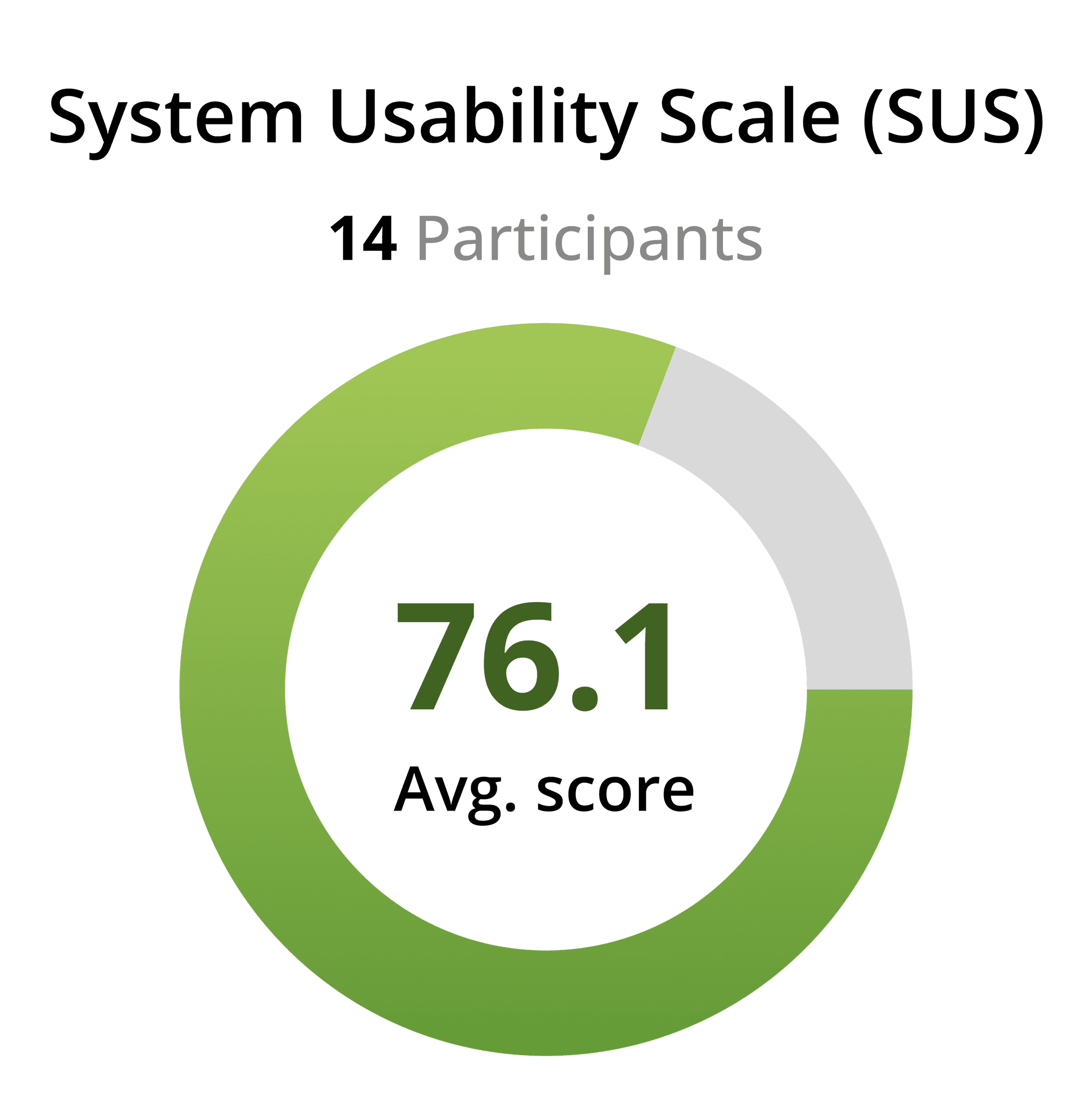
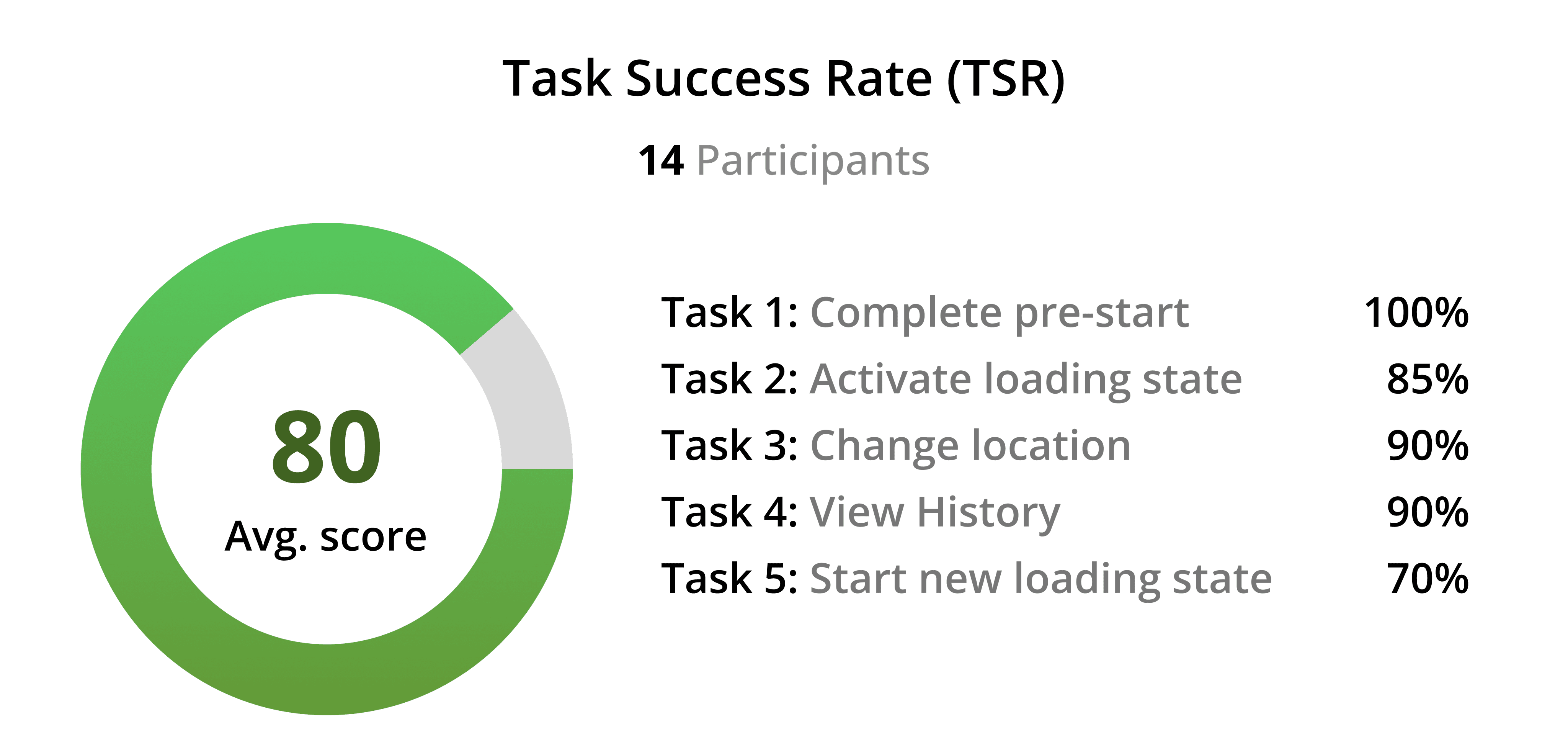
Visual icons and minimized navigations increased decision-making and faster task completion.
Removing the bottom navigation bar allows users to navigate through the app more quickly.
New UI led to higher user engagement and satisfaction.
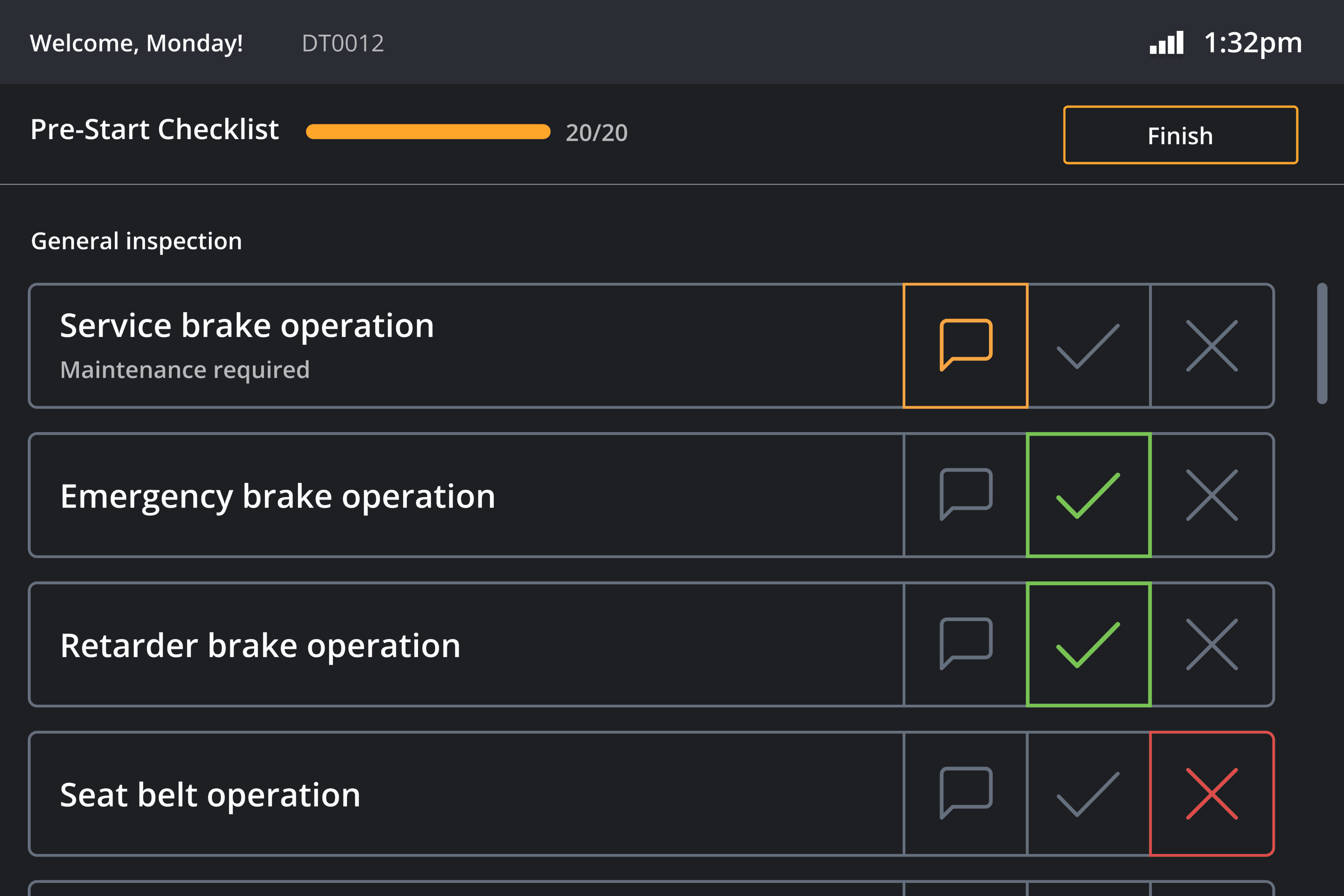
PRE -START CHECKLIST
Ensuring that the machine is safe to use
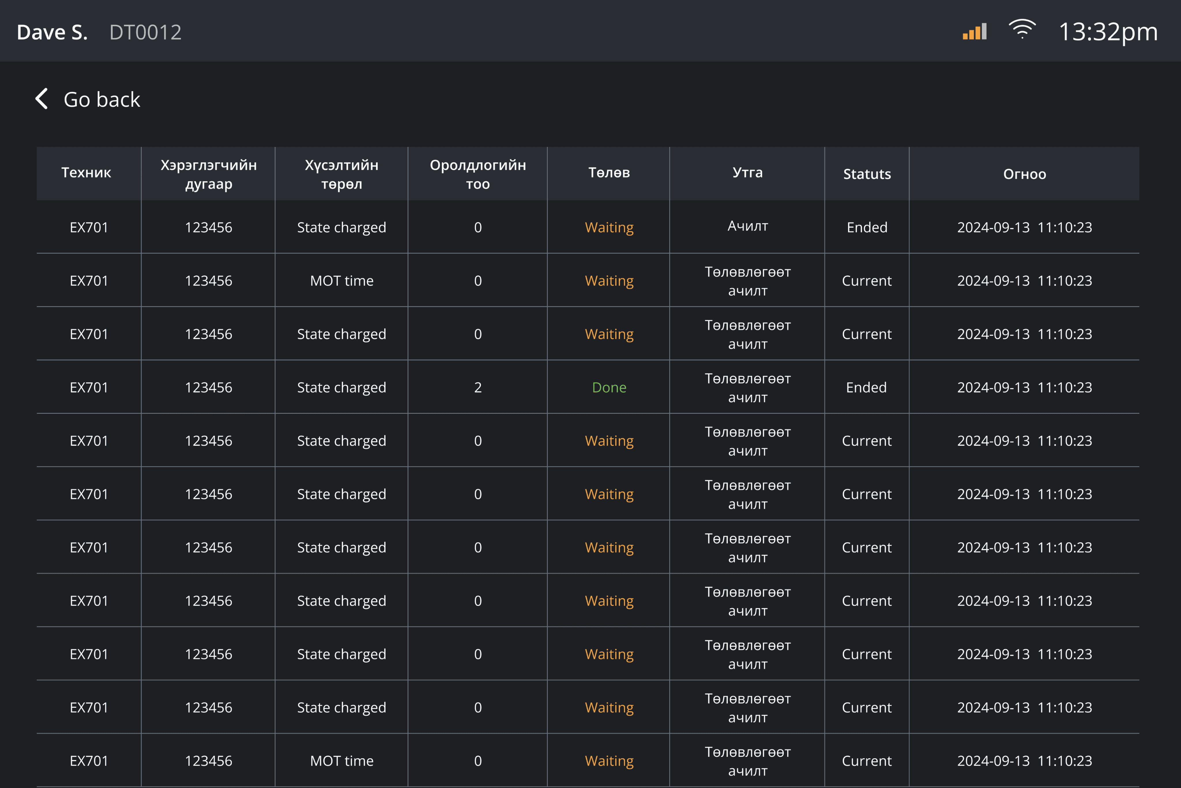
VIEW HISTORY
View previously logged status with brief information
VISUAL SELECTIONS
Clear, visually-driven selections with distinct icons
ACTIVE STATUS
Comprehensive information on a single screen
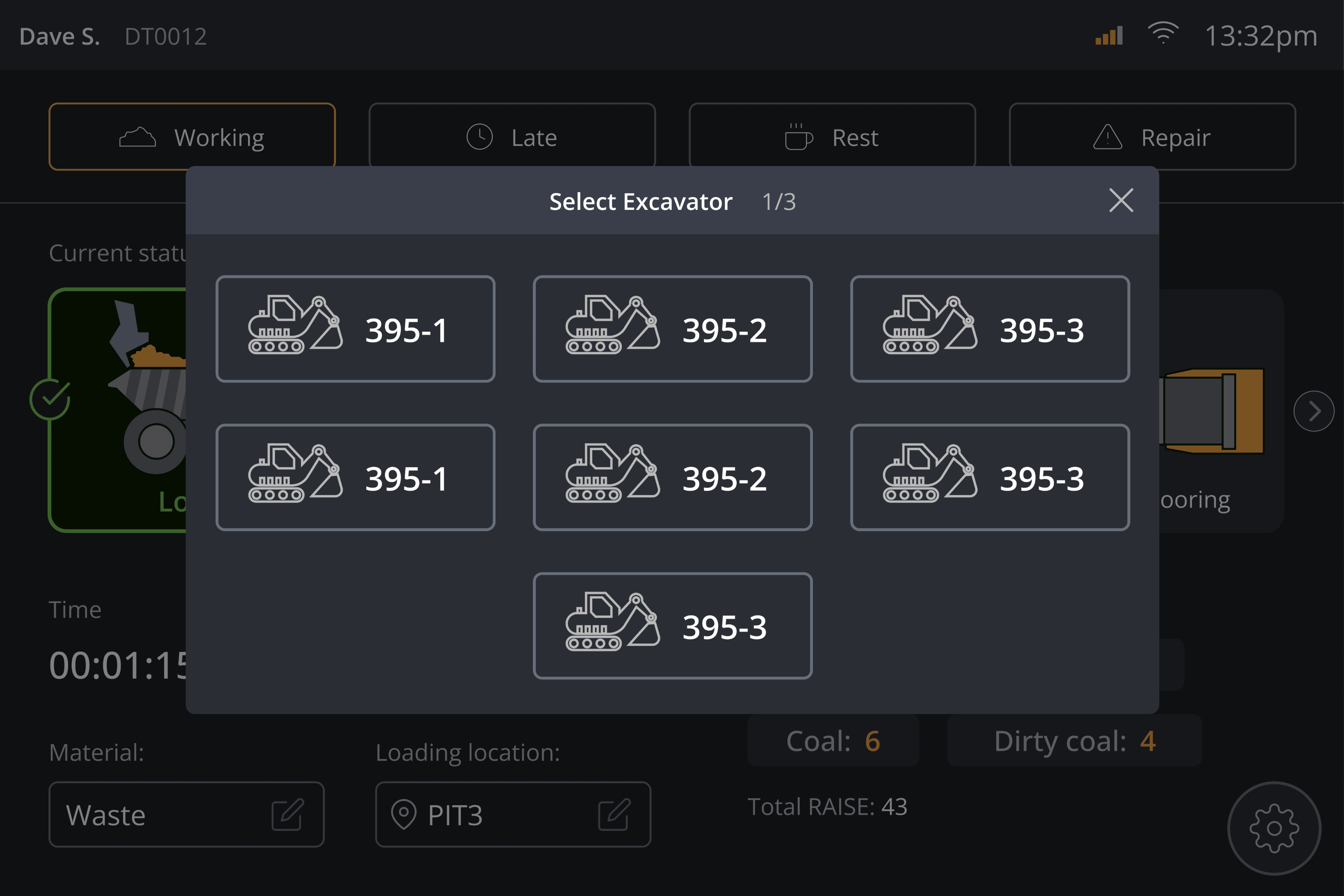
POP-UP SELECTIONS
Pop-up navigation without switching screens
CONFIRMING STATUS
Providing users with visual confirmation
See other projects
